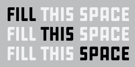
Roger Excoffon (1910–1983) was the most talented French type designer of the 20th century and probably the most prolific in the whole of French typographic history. Being an admirer of Excoffon’s work myself I was happy to see that 2011 has brought a sudden re-appreciation of his work in the form of no less than two biographies, along with an interesting take on Mistral (called Nouvelle Vague) and Zizou.
In the words of designer Christian Schwartz, Zizou is his attempt to “draw Antique Olive from memory”. The name Zizou is a clever and witty reference to the city where Excoffon was born: Marseille.
When Antique Olive was released in 1960 it was regarded as the French answer to the rise of the highly successful neo-grotesques of the time, most notably Univers and Helvetica. It is interesting to notice that this style, and in particular Helvetica, has seen a gigantic re-appreciation (or rather over-appreciation) during the last five years.
Will a similar thing happen to Antique Olive? Probably not, since it is too outspoken in comparison to its contemporaries. A prime characteristic of Antique Olive is its play with balance and imbalance thereby breaking conventional rules for stroke contrast. Excoffon believed that by deliberately thickening the most important parts of a letter it would gain legibility.
Zizou appears to have swapped this radical idea for a return to a more conventional stroke contrast. Some critics might argue that means the design was watered down, but that’s too easy. Zizou immediately conveys this very specific Antique Olive atmosphere in a manner that is unique and highly suitable for today’s design. It does its job beautifully and admirably in the tightly tracked headlines of FastCompany which has exclusive rights to the typeface.
Now let’s hope 2012 will bring us more spiritual successors to Excoffon’s legacy executed so well.


Can you tell me where to purchase these fonts? I checked the Commercial Type web site but they are not listed there.
Zizou is a custom design for Fast Company. It is not (yet) available for public licensing.
Zizou was released as a retail family under the new name Duplicate.
[…] first big change was hiring Christian Schwartz to create two custom typefaces for us: FC Kaiser and FC Zizou (sans and serif). The faces have multiple weights which gives us both a functional variety and a […]
Is Duplicate is available for public licensing now?
Yes, see the link above.