
For nearly three months last year, I drew some type every day. My “Daily Typesketch” was an experiment — in drawing, discipline, public practice, and in getting less fearful of process and paper.

-

- process (pretty view)
-

- My initial drawing getting grilled at TYPO Berlin 2012. “Very pretty sketch. In class we would ask: Where is the process behind this?” (Photo: Diana Ovezea)
-

- June 2: narrow, plain roman; stroke endings: straight, no serif; ascenders and descenders shorter than normal; very high contrast, transitional type; stems: flaring; intended for packaging at, display sizes; use only straight lines
-

- June 4: medium-weight monospaced caps; stroke endings: a serif; very low expansion type contrast; straight stems; intended for signage at display sizes; must contain at least 1 ligature

-

- June 12: extra bold, extra condensed proportional oldstyle numerals; stroke endings: a serif; ascender much longer, descender much shorter than normal; high translation-based contrast; visibly concave stems; intended for packaging at display sizes; cut as a stencil

-

- June 13: extra light, normal-width italic; stroke endings: a serif; ascenders shorter, descenders longer than normal; visible translation-based contrast; slightly concave stems; intended for signage
-

- June 18: medium-weight monospaced italic; slab shaped serifs; ascenders shorter, descenders much shorter than normal; no visible contrast (which would be expansion-based); visibly concave stems; multi-purpose, for most sizes; cut as a stencil

-

- July 2: extra condensed book italic; straight endings, no serif; ascenders and descenders shorter than normal; no visible contrast (which would be translation-based); straight stems; intended for smooth offset printing at display sizes; must contain at least 2 ligatures

-

- July 5: Freestyling a pointy reverse-contrast sans
-

- July 10: bold extended italic; straight endings, no serif; ascenders and descenders shorter than normal; high expansion-based contrast; straight stems; multi-purpose

-

- July 16: extra light, normal-width proportional oldstyle figures; rounded endings, flaring stems; ascenders shorter, descenders longer than normal; no contrast at all (which would be transitional); intended for newsprint at reading sizes; initial and terminal swashes
-
- July 21: narrow bold roman + capitals; flaring stems, asymmetric serifs; ascenders shorter, descenders much shorter than normal; very high translation-based contrast; multi-purpose, for most sizes; cut as a stencil
-

- July 29: compressed extra bold capitals; slightly concave stems, wedge shaped serifs; very low, expansion-based contrast; intended for smooth offset printing at very small sizes; must contain at least 1 ligature
-

- August 2: Helvetica as drawn by Gerard Unger, but as a grunge face and monospaced (!)
-

- August 6: extra condensed, plain italic; flaring stems, wedge shaped serifs; ascenders & descenders shorter than normal; very high expansion-based contrast; intended for smooth offset printing at very large sizes; must contain at least 1 ligature
Let me say this first: I know there are many designers who draw more and better than I; who have sketchbooks filled with lovely letters and exciting experiments. My hat is off to them, because I’m not like that. I’ve always thought of myself primarily as a digital designer — computers are my playgrounds, while paper usually instills in me a vague sense of dread (or at least, inconvenience). So it felt like quite an experiment last year when I committed to drawing some type every single day, on paper, and posting a photo of the sketch to a dedicated Flickr set.
I had been getting a bit frustrated in the months after finishing my first typeface, FF Ernestine. Over the course of three years, I had learned to draw type by making that typeface, and now every letter I drew still looked like it wanted to be part of that same family. I longed to diversify, but wasn’t sure how.
Process, Paper, Patience
At TYPO Berlin a year ago, I participated in Erik van Blokland and Paul van der Laan’s wildly popular TypeCooker critique session. I had known TypeCooker before — Erik’s “tool for generating type-drawing exercises”, which, in a manner of speaking, offers guided walks out of one’s type-drawing comfort zone. Pick a type of exercise and a level of difficulty, and the site generates a random combination of parameters, a “recipe” to follow. My TYPO submission was a narrow, tall, contrasted sans that was reasonably hard to draw, and I sweated over it for the better part of a weekend until I deemed it nice enough to show. “This is a very pretty sketch” was the verdict, “but where is the process?”
That was when I realized I wanted (and needed) to get deeper into practice, into the process. Indeed process, like craft, seems fairly obvious to honor in theory and principle, but harder to embrace in practice. In-progress work is uncomfortable, it shows more open questions than answers; and “uncertainty”, as Paul Soulellis wrote in The Manual, “runs counter to how we’re trained to articulate our design values.
We’re taught to express clearly and certainly”, but in-progress work is usually not clear yet, craft is messy and dirty, and sometimes you hit a dead end. Facing this is unsettling — maybe especially so for a generation of designers raised with the shiny precision of computers. We love that precision, even if deep down we know that it’s often a lie. The precise numbers of computers can make our work look like we’ve found answers when really all we have are questions, and the only truth we know is vague.
It is in this crucial point that paper is friendlier to the creative process than the screen: It supports (and renders) vagueness, sketchiness, better than computers do.
Type Cooker creator Erik van Blokland demonstrates the type sketching method passed down from Gerrit Noordzij and taught in the Type and Media program at The Hague.
Embracing the famed “inside out” drawing technique was a key to the whole exercise. The basic idea of starting with fuzzy shapes and gradually “bringing them into focus”, making the shapes cleaner as the ideas get clearer, is tremendously helpful (and can, I think, be applied to all kinds of shapes, beyond the classic application echoing the strokes of broad-nibbed or pointed pens). Thus one gradually progresses from general proportions to details. This is likely the correct hierarchy of decision making — first fixing what is most relevant and visible in type, even at text sizes (proportion, weight, contrast, the rhythm of black and white), before getting hooked on little details.
This was an exercise in patience, too. I am better at details than the conceptual “big picture”, better at refining than defining, and the computer makes it a little too easy to jump right into the details, with which you fiddle around forever until you realize something big is off anyway. (I’ve lost count of the times I had to redraw all the curves in Ernestine because I decided the x-height wasn’t right yet after all.)
Letting Loose
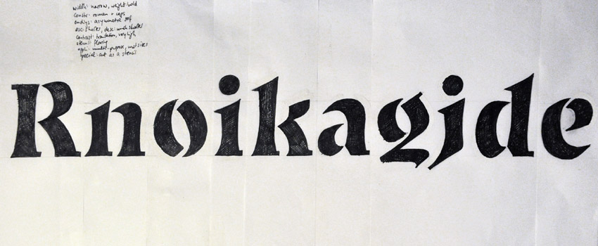
So I started drawing, and I drew every day. Most of the sketches were based on TypeCooker, which made me draw things I wouldn’t usually draw, or even think of as good ideas. It asked for wide seriffed faces and compressed sans serifs, but also such strange things as a monospaced upright italic for TV subtitles, a wide light monoline serif with swashes but no ascenders, or a grunge monospaced Helvetica as drawn by Gerard Unger. (Making sense of these turned out to be interesting.) I drew with an x-height of 4cm on an 11×14 inch pad of transparent marker paper, tracing over the drawings in multiple steps when necessary. Typically I’d do 5–10 letters, a variable basic set that could form the basis for a typeface design (for lowercase this was typically an ‘o’ or maybe ‘e’, at least one arch, something with an ascender, something with a descender, one bowl-and-stick letter, and of course some diagonals and special favorites like ‘a’, ‘s’, or ‘g’). Usually I first made a quick, rough pencil sketch of the approximate structures and proportions, then started working with a pen as soon as I dared, sketching rough proportions and areas before filling in outlines and details. (I never quite lost my urge to add outlines prematurely, but doing this too soon invariably derailed the sketch.)
The learning curve was noticeable. A good month into the experiment, I tweeted: “Best parts of #dailysketching: Slowly sensing better where black needs to go; & understanding I can build outwards from that fuzzy vision.” It still took courage to lay down ink; applying a dab of slow-drying Tipp-Ex is not the same as hitting Cmd-Z, and having to cut up a drawing to get the spacing right does not feel the same as adjusting sidebearings on screen, where space is elastic and erasure leaves no marks. But my fearfulness of the physical process was evolving into thoughtfulness, my dread into respect.
I learned to think about type in new ways, practiced looking at it differently. I squinted, “unfocused” my eyes, and used a reduction glass. I learned to see the space between the letters as an inherent part of the design. I tried lots of different pens and attempted (mostly in vain) to trim the Tipp-Ex brush just the right way. And I began to feel more free to take on new ideas and try them out on paper without overthinking details right away. Six weeks into the experiment I was “letting loose on … things I’ve exactly never drawn before”, as I wrote happily in the caption to a funky, brushy, reverse-contrast script sort of thing that I wouldn’t have conceived of trying to draw before. I had finally stopped worrying so much, and I was making letters, every day. Letters that didn’t look like Ernestine. Letters that didn’t look like they were finished, or had to be.
Public Practice
The decision to make drawing practice a daily exercise was a trick to make me stick with it. Keeping it up was a challenge sometimes, but it also brought beautiful opportunities, like drawing together with friends I happened to be visiting. In a similar way, publishing the work online was intended to up the pressure and confirm my commitment, but I also hoped it could trigger discourse that might prove helpful to me and maybe also inspiring to others.
Of course, if embracing sketchiness and vagueness on my desk was hard, sharing it publicly was really scary. But I felt I needed to overcome the anxiety of showing something that isn’t as “clean” and “finished” as can be — for sometimes polish is simply not the point. In contrast to other “daily” doses of impressively final-looking work (like Jessica Hische’s famed Daily Drop Cap), sketchiness and roughness are at the heart of my experiment. My sketches are snapshots from a process, stills from a learning curve.
The project ended about as spontaneously as it began. After almost three months of daily drawing, and quite a bit of welcome input and exchange, I went on a vacation with a barely functional internet connection and the desire to disconnect from my routine for a bit. I look back fondly. I’ve learned a lot: much about the myriad shapes that type can take; some sketches have spawned little digital typeface prototypes; and I got out of my deadlock and frustration. While there remains so much that I haven’t yet learned, there is this: It’s true that if you want to draw type, then go draw type. Every day, if you have to. Try doing it loosely, looking beyond your own preferences, and resisting the pressure of polish. You will find new answers — and, what is more, new questions too.
Well written piece, Nina. I like the discovery that your letterforms have to be built from the inside and take shape around “where the black needs to go”. If only our type design software could deal with the fuzziness, roughness, undecidedness and immediacy of physical mark-making.
Aside from your KABK class next year, do you think you’ll go back to TypeCooking? I mean, I’m wondering whether it’s more a learning tool or a useful part of professional practice.
Fascinating stuff, Nina. I like that you get into some depth here, and it also strikes me that the idea: process, paper, patience could be applied in many useful ways outside of the disciplin of type design too.
Also, It’s great to see so many visuals accompany this article :)
Very nice! Good luck in Den Haag (and let’s then have a beer sometime)!
Watching Nina’s posts of these drawings as they appeared at Flickr was en enlightening experience, and inspirational. Form is the point of type and letter design, and always will be. Freehand drawing induces a freedom of line and subsequent outline(s) that do not arise naturally when working with bézier drawing tools. Type Cooker exercises can also conceivably be done on a computer with the aid of a drawing tablet, and while it would be very interesting to see what results, producing a drawing using pencil, white-out and ink on drafting film or paper makes you do things differently. And as I like to say — anything different is good!
It’s also more fun.
Hi Nina,
Thanks so much for this very inspirational text. I am not a type designer. This is very inspirational and I might follow your lead and start drawing type! I also recognise your problem of being so focused on details and stuck in a process. Making a change in the process, trying a different medium, and sticking with it is indeed a great way to get on with it.
By the way, I think my working method is the reverse of yours: I love drawing by hand, but beziers freak me out. :)
Hey, thanks for the nice comments – I was happy to share this experience, and am glad to hear some found it interesting.
Ben: good question. I’d like to think I’ll come back to type cooking again and again – I’d expect it to it be quite useful to clear one’s typographic palate so to speak, and somewhat playfully explore new ideas, not just inside a learning process.
One thing I forgot to mention is that early on in the process it took a lot of effort just to figure out how to fulfill all the parameters in a TypeCooker recipe. Towards the end I began to see the parameters more as starting points or guidelines for something that, beyond fulfilling this brief, should also be interesting and have some kind of design personality of its own. So I do suspect that this only gets more interesting with practice.
(And Jacques, beer: sure! :) )
Nina, this is an excellent post. I like that you explained it in such detail.
I am in the same situation as you were at your beginnings. But with one difference. I am not interested in designing type. I am interested in type drawing and calligraphy. I used to doodle and sketch as a kid, and up to my college years. Notebooks filled with letters and some graffiti. And then I stopped. Just like that. Now 20 years later I want to draw letters again. And I drew every day for the last month. But I do get so frustrated at the times for not getting the results I want. I cannot get the strokes right, the contrast between thick and thin lines is sometimes good, sometimes bad. I tell myself it is just the matter of practice. It will get better.
I will try this Type Cooker. Do you use transparency paper and then redraw the examples that are below it, acting as a reference?
Thank you again. I am glad that other people had the same problems when they started out.
Thanks, Nikola – I’m glad you enjoyed it.
Yeah, I’d definitely recommend the sketching. I guess everyone is different, but for me it worked very well – and it’s certainly true that the drawing hand gets rusty if you don’t do it for a while. I’d almost bet yours will return once you get back into the swing of things. Good luck!
Transparent paper can be useful for tracing in multiple steps. Or to “copy” between multiple letters, like when you’re making a ‘h’, putting the ‘n’ in the background might be helpful. It’s going to be a bit trickier if you don’t have that option, but drawing on normal paper surely works too. I actually ended up not tracing a lot, but to keep that option open, my favorite paper for this is translucent rag/marker paper that can be used for tracing but is also nice to draw on (unlike paper vellum). Surely not necessary, though.
Thank you for the tips. I see some progress since the beginning and I see that it is the practice that makes perfect drawings.
Loved the article. Thanks for sharing your insights in such great detail.
Beautiful. Very inspiring. I like that you went for a sketchy, less polished approach. That was very brave of you and it has inspired me to begin to draw type (loosely and otherwise) everyday as well. I will also use the TypeCooker to help broaden my knowledge of drawing type, so thanks for sharing that website. Practice makes perfect (or as close to it as possible). ^_^
Awesome, I’m thinking about doing more drawing in my sketchbook and this is inspiring.
This article is really very inspiring. As a student studying graphic design, I work in software that generates type for me. I am very used to clean and “polished” type, as you say. While I believe I do have an eye for typography, I feel that I am limited working on a machine. The art of craft is lost. Reading your article has motivated me to start drawing type. Your sketches are beautiful. I love the technique of starting inward and working out.
[…] STÖSSINGER, https://typographica.org/on-typography/sketching-out-of-my-comfort-zone-a-type-design-experiment/ (accessed: 18 February, […]