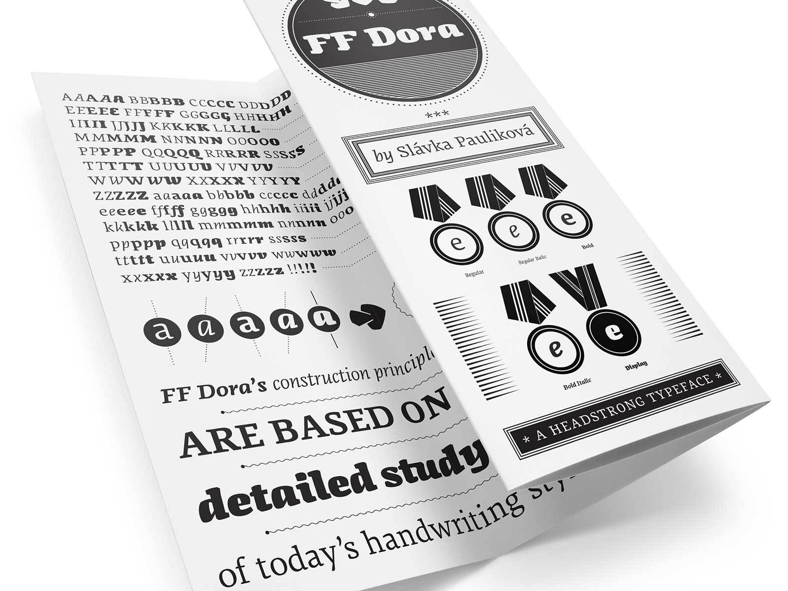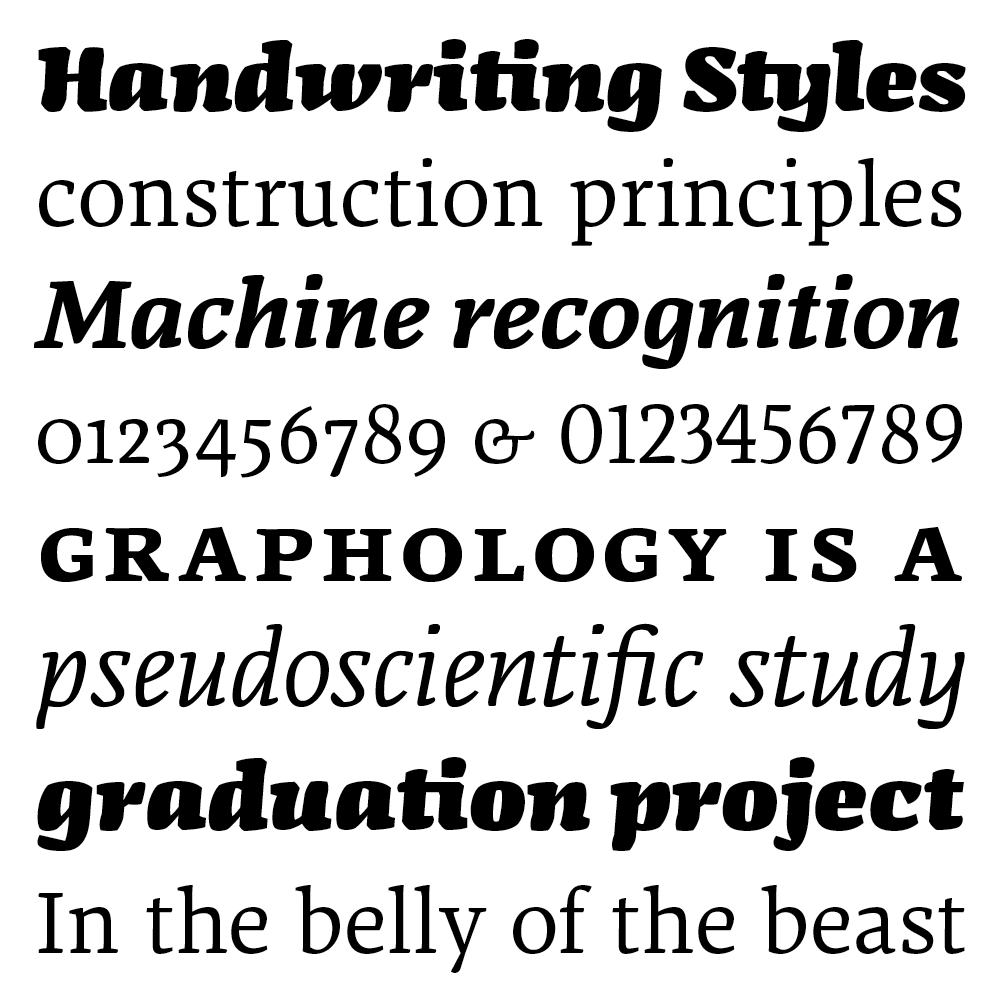
FF Dora differs from other text serifs in important ways. Where many are dressy, Dora is casual like a favorite pair of jeans. Where some are rigid and precise, Dora sways like a restful young tree, with subtle and characteristic knobs and bends. Look to Dora’s italics and bolds, and you will see these traits even more clearly.
My, it is lovely.
But it’s more than a pretty face. It seems part of a continuum of a certain contemporary style of serif. In Dora and likeminded predecessors such as Fedra, Dolly, and Elena, one can sense the future of type: similarities, differences, nuance — yet clearly individual and worthwhile typefaces. There are amazing opportunities ahead to give voice and form to text in beautiful and unique ways. To make and use new typefaces.
The tools and skills necessary to do make new type — and to do it sustainably — have never been more accessible. So, people are going to make many more typefaces. What does that future look like for type designers who are trying to earn a living? Or for graphic designers looking to make good choices?
We vote with our wallets, but we decide with our hearts. Where will our hearts rest in a future that is saturated by both subtle differences and outright forgery? How will we overcome the forces of popularity, algorithm, noise, and seclusion? Will anyone enjoy more aggressive marketing? Will we take a vacation and hire a sherpa to find rare typefaces? Maybe we’ll just stick to the faces we know, because it’s all so overwhelming.
No. We will teach ourselves about type. We will learn what typefaces can do. Talk about the feelings in their shapes and spaces. Share our hopes and our intentions, as Slávka Pauliková has done.
Thanks for another year, Typographica, and for another opportunity to teach ourselves about type.