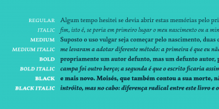
Garibaldi shares a common trait with many of my favorite typefaces. It’s the result of a clear design goal pursued with a contemporary eye, rooted in tradition. It’s also the result of Henrique Beier’s decision to expand his 2014 award-winning Garibaldi Regular into a rich family that can perform typesetting duties large and small.
Beier describes Garibaldi as a text face based on humanist calligraphy, built on “the traditional construction of roman typography”. But this description doesn’t quite capture Garibaldi’s spirit for me. His designs feel unafraid of their own origins; and that must be due to Beier’s discerning taste. He lets those calligraphic roots enrich every character with a lively rhythmic energy that lets Garibaldi dance. But in that same movement, he pursues strong, clear forms that move with a consistency crucial for text typesetting. In doing so, his own judgment comes forward, giving Garibaldi its individuality.
I was delighted but unsurprised to find out that the lowercase ‘x’ (my favorite) is one of the specific moments where he consciously set aside David Harris’ humanist model. Rather than merely trading away calligraphic influence to reach simplified forms, he also “amplified the small quirks”. He even redrew characters in the original regular weight to ensure consistency across all four, as these details had to perform in new conditions. Simplification was a tool to create space within which distinct moments of personality could harmonize.
When I asked Beier about his process, he emphasized the amount of information that a calligraphic stroke contains. For me, that understanding is central to what sets Garibaldi apart and makes it one of my favorites of 2015.


