When it comes to typography, falling down the rabbit hole is easy: there’s enough history, tradition, and artisanry to last several lifetimes. However, as designers, we shouldn’t forget the variety of human needs our forebears solved millennia before the invention of writing. These include architecture, cuisine, and fashion — the good ol’ trio of shelter, food, and clothing.
Architect Peter Behrens wrote that “next to architecture, [type is] probably the most characteristic indicator of […] the development of a nation”. In praise of building, let us not forget the designed items we hold even nearer.
James Todd, the man behind Garvis, is a tailor. The cutting and sewing of clothes seems a fitting parallel to me for the development of typefaces. Like the clothes we wear, letterforms and fonts are made up of numerous individual elements that must work together seamlessly. Rarely do readers think about the details of a text before them; they expect everything to simply fall into place. Garvis does this, and achieves it well. Although not created as part of a postgraduate degree course in type design, Todd’s typeface feels like polished student work — and I mean that as a compliment.
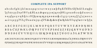
It’s easy for a first font release to fall flat and then disappear into the MyFonts ether. Despite only offering a complement of three fonts — just enough for book work, but perhaps a cut or two too few for a general-use graphic design family — Garvis’ attributes in terms of character-set size, general polish, and its working-together quality earn it a slot in Typographica’s 2012 list.
As a final note, Garvis is a rare example of a well-designed typeface coming out of the Typophile Critique Forums — like Nina Stössinger’s Ernestine, one of 2011’s notable releases — reminding us of what sort of a resource the internet can thankfully prove for self-taught professionals. Garvis’ assured handling in text intended for immersive reading gives me hope for Todd’s future as a type designer. I look forward to seeing more of his work — and I should also check out a suit or two of his while I’m at it.


It was great to watch this design grow up, go to college, and get a job! James is a proud dad for sure.