We are in a period in which media — both digital and print — is thriving, offering new opportunities for editorial typeface design. Helvetica/Futura and Bodoni/Didot — archetypal magazine faces — are increasingly challenged by numerous contenders, each aiming to redefine the notion of “Now”.
So what does “Now” look like in contemporary display fonts for editorial use? “Now” is in the daring, dynamic, and, at times, arguably un-beautiful yet fit-for-purpose designs coming from Production Type. Another “Now” is in the modern-vernacular and free-spirited editorial designs from Commercial Type’s team. Then there is a confident and polished “Now” oozing from the display designs of Klim. Then there are the wildly sharp and rationally deconstructed “Now” designs from Swiss Typefaces. To name a few.
A less obvious answer for “Now” would include Grifo, a design published by Rui Abreu’s R-Typography.
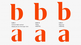
Grifo is Portuguese for “griffin”. Rui says there is a strong link between Grifo’s design and its name. For me, the sharp triangular serifs neatly summarize this. Although Grifo has some nice fat faces, I fail to connect the lighter, high-contrast weights with a griffin’s muscular body. Personal doubts aside, choosing names for typefaces is rarely an easy task and so, all in all, Grifo still gets high marks.
With Grifo, Rui makes cunning use of a number of design details that avoid the clichés too often perpetuated in high-contrast faces for editorial use. Grifo is ultra-high contrast, indeed, but far from a Bodoni. Its proportions, flair, and details, such as the memorable triangular serifs, do the job and succeed in propelling Grifo’s design further than the usual Bodoni/Didot aesthetic.
Looking at Grifo’s outlines in detail, they seem to carry some deviations, arguably little faults in proportion. I, however, tend to regard such “imperfections” as positive, hoping these add to the design’s overall character, possibly making Grifo easier to recognize. At the end of the day, Grifo has both the quality and momentum it needs to make it onto the world’s leading covers and spreads.
Somehow I’m not surprised to see Grifo coming from Portugal — Rui’s fellow countryman Dino dos Santos has been prolifically experimenting with editorial faces for over a decade now. With Rui Abreu’s Grifo, it seems that more notable Portuguese editorial designs may be coming our way to redefine the “Now”.


Fred, don’t you see in Grifo some resemblances with Letters from Sweden’s Eksell Display?