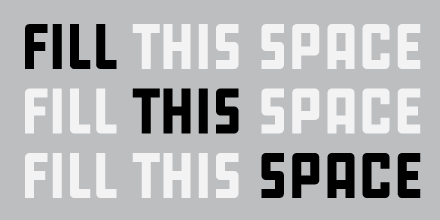
Art directors today may be setting headlines in the thinnest of typefaces, but Karsten Lücke has never been one to follow conventions. An OpenType encoding theorist, independent type designer, and member of the Village collective, Karsten doesn’t just design typefaces, he crafts them. His newest release has four family members, but its lightest weight is still bold. Big is beautiful. Why? It’s in the curves.
Like his TDC2 Award winning KLTF Litterata, Tiptoe is subtly inspired by early blackletters. Just as scribes would fit more letters onto a page by breaking the curves on their strokes, Karsten tells the forms in Tiptoe who’s boss. Instead of letting the curves themselves define weight growth, his unorthodox angles allow for more density without sacrificing letter integrity. The result is a heavy face with surprisingly open counters and increased legibility.
Tiptoe is a sans serif that handles the play between black and white marvelously. Its characters are a joy to look at, and an inspiration for everyone facing the task of designing really heavy type. Ready to buck the trend and show how beautiful big really is? Don’t just take my word for it; download a trial version. — Dan Reynolds

