
I am a sucker for bodacious headline typography — the sort that is over the top, tight, bold, in your face, and set solid. Who’s with me?
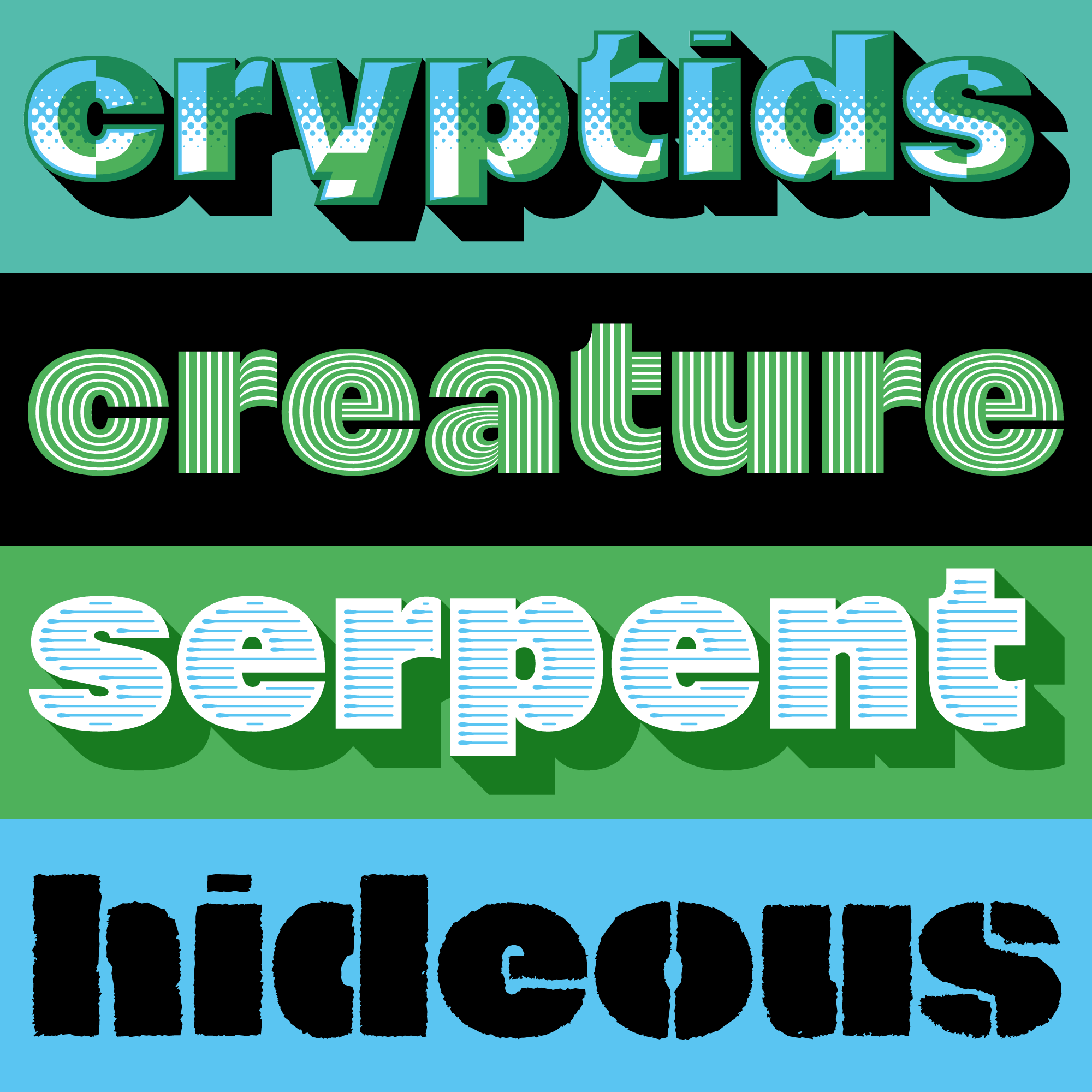
Nitti Mostro makes me wish I had a bunch of 200pt headlines for an ad. Or magazine spread. Or poster. Or banner. Or billboard. Or movie title for an IMAX theater! Can you see it!? Pieter van Rosmalen did not mess around when he expanded upon his Nitti Grotesk Ultra for Bold Monday. This is not a typeface for the timid; neither is it another twee* chromatic design. Eighteen fonts, four subfamilies, and more potential combinations than I can wrap my head around.
Generally I am very skeptical of any typeface that comes locked and loaded with so many bells and whistles. I mean, why include them when there are so many ways to make them on my own, right? But for this family, I can really see that time was spent on exploring ideas and drawing meaningful and useful shapes. For starters, it has solid, shadow, inline, inline solo, gradient, gradient solo, stripes, stripes solo, chrome, chrome solo, comic, comic solid, comic shadow, disco inline, disco floor, disco shadow, stencil solid, stencil shadow, stencil rough, and — sheesh I’m out of breath just typing that — last, but not least and possibly coolest of all, actual wood type. Squat and square, short ascenders and descenders, set alone or layered, Nitti Mostro is positively ready to handle any grandiloquent words I might have in mind.
* You know, I’ll wager someone could use Nitti Mostro Inline Solo to do something really quite experimentally classic. But it would still be bombastic.


Hope this comes out as an OpenType SVG colour font soon. Life will be easier.