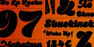
Let me get the obvious out of the way. Sutturah, Octavio Pardo’s first commercial release, isn’t versatile or a workhorse. It’s not ideal for setting small text or many of the other prized descriptors lavished on typeface designs. It possesses another descriptor of arguably higher import, something missing from too many fonts today – a distinct point of view.
A “point of view” is really just a shortcut phrase to say a designer has the ability to ingest all that is going on around him or her, including the work of fellow designers, and still create something that expresses the creator’s unique experiences, skills, or way of thinking. You will find echoes of Sutturah in other typefaces – the brushy exuberance of Bello, the incisions of Klimax or the ultra weight of Tomate. But when all is said and done, Sutturah can’t be confused with any of those faces.
Think of Sutturah as a collision of competing desires. On the one hand, it’s jovial, overstuffed, and good-natured. On the other, it’s got a taste for fast cars and loose women. Yeah, I said loose women (change it to men, if you like). There’s an undercurrent of speed, recklessness and mischief – carried out formally in part by Sutturah’s incisions – that transforms the typeface into something beyond the sum of its parts.
As of now, Sutturah is a single weight with glyphs supporting Latin-based languages. Its publishing foundry (Rosetta) focuses on multi-script fonts and, to that end, promises a Cyrillic is in the works. Adding the extra glyphs should be relatively easy for Octavio but after setting the bar this high, his next release might be another story.


I love this! My highest compliment: envy.
I just realized that Octavio’s birthday is today!
Wow, I have no words. This article is just too cool and too beautiful. And Marian! What a comment!!! :O You made my day! Thanks to both so much.
Incredible stuff. A distinct point of view. And a very original one.
Me encanta. ¡Felicidades!
Woah, Thank you Gabriel. Coming from someone like you it means a lot… Un abrazo maestro, mucho respeto.
La verdad esta tipo es increíble. Muy muy buena, te felicito Octavio.
Luscious.
BTW, I know that Klimax already has an Italic … this could be its Cursive!
Gracias Maximiliano ¿qué quieres que te diga de tu Reina que no te hayan dicho ya? Por cierto ayer compré una licencia de Aphrodite ;) Excelente!! Un abrazo.