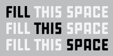
Whereas TheSans is friendly, round and wide, Taz is more reserved, more angular in its curves (causing its characteristic text pattern) and more condensed. Originally designed for the German newspaper of this name, Taz has grown into a family of 15 weights, including extremely thin ones, which should satisfy every need. This makes Taz a perfect workhorse. Actually it is one of very few typefaces I have licensed and used, and I am delighted to read that it has been updated recently.
What makes me so particularly fond of Taz and other de Groot typefaces is the care with which they are made, and most of all, their excellent spacing and kerning. Even setting all caps is not a hassle but fun. I don’t know if this can be said of many other typefaces. Spacing must be one of Luc(as) de Groot’s obsessions, not only expressed in the actual work but also in presentations and interviews which repeatedly emphasize the need not only for kerning pairs but for kerning triplets (thanks to OpenType, this is possible now). Taz III embodies both theory and usability.
Karsten Lücke is a type designer and typographer based in Germany. He studied communication design and worked at Steidl Publishers in Goettingen from 2004 to 2005. Since then, he has focused on type design. His Litteratra was selected for Typographica’s “Typefaces of 2005” and Tiptoe was selected in 2006.


He really is obsessed with kerning. He hold a speed at the last “Bundestreffen für Typografie” in Germany and they mentioned his search for kerning pairs in the different European languages. He really is addicted to that ;-)
And by the way – he created the thinnest typeface in the world (you can only print it at 1000pt Font Size) and yes, i am using one of his fonts, too ;)
Maybe it’s just my personal taste, but I’ve always found the spacing of Thesis to be troublesome… I knew Taz was one of his before I even saw his name because it exhibits the same problems.
In the sample above look at the word Revolte. Rev is much tighter than vol, the lt looks like it’s clumped together floating. earthquake reads like e a rth q u a ke. The heavy weight stuff looks pretty decent.
Am I just fooling myself?