Triade asks its users to have an open mind.
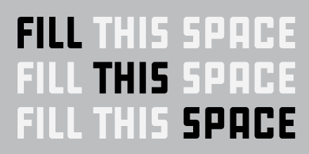
Its most obvious feature is that the single extra-bold weight comes in three styles: Upright, Slanted, and Backslant. The atypical label “Upright” is notable here; instead of calling that style “Triade Standard,” “Black,” or another conventional term, the nomenclature argues for all three versions being equal.
Triade’s creator, Étienne Aubert Bonn, decided on full parity between the styles’ character sets, a choice that asks the user to pause before unthinkingly setting every letter and line in Upright. Why not backslant your subheads for more zest if every Upright character has a Backslant version? What if you alternate lines of rag-right Slanted and Backslant for a pleasing wave on the left edge?
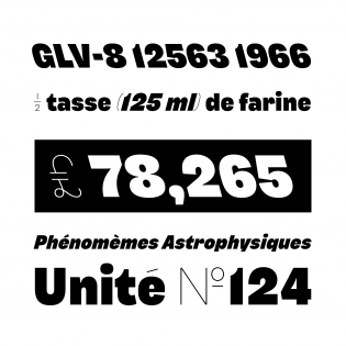
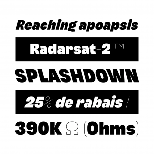
Type some of this grotesque’s symbols — a dollar sign or other currency symbols, an asterisk, nut fractions, superscripts, parentheses, brackets — and you’ll discover a second surprising trait. These glyphs are rendered in an attractive hairline weight, contrasting with the remainder’s potent, ink-trapped letterforms. The thin weight can optionally be applied to more common punctuation marks and diacritics, a smart tactic to keep complex headlines streamlined. Further, another stylistic set elaborates a handful of the hairline symbols with loops and extra strokes.
By making certain symbols only available in a thin weight, Bonn again asks a designer to explore Triade’s possibilities. And though the extra light weights might suggest that the punctuation, symbols, and diacritics are secondary to other glyphs, the ornamented versions imply that they deserve serious attention.
Triade can sometimes feel limited. Using it myself, I pined for a g with a closed loop to make my headings less casual. This tightly edited typeface does not offer it, providing only an alternate g that is even more unusual than the default. But being encouraged to try something new is what makes designing with Triade a memorable experience.


[…] backslanted styles are on the rise again today thanks to research, experiments, designs, and releases from […]