
Robert Bringhurst has issued the latest edition of what Hermann Zapf called the “Typographer’s Bible”. The news will surely be welcomed by his ardent followers, but does the book speak to a modern congregation?
In 1992, when the first edition of The Elements of Typographic Style was published, Bringhurst was already an accomplished poet and translator of poetry — most notably Haida poetry, but also Navajo, Greek, and Arabic — into English. He was also a self-trained and accomplished book designer, and Elements was his attempt to catalogue and summarize the best practices of book typography and design, loosely according to the model provided by the book’s namesake, The Elements of Style by William Strunk and E. B. White.
The book was a huge success. Four subsequent editions were published, labeled (somewhat incongruously, given Bringhurst’s approach to typography) versions 2.0, 3.0, 3.1, and 3.2. Now, on the book’s twentieth anniversary and eight years after the last release, a version 4.0 has appeared.
It’s hard to overstate the reputation Bringhurst and his book have gained in the typographic community. It didn’t hurt that Zapf blurbed the book’s first edition by calling for the book to become the “Typographer’s Bible”. More recently, Hoefler & Frere-Jones have called Elements “the finest book ever written about typography”. It appears on countless syllabi and reading lists, and is one of the “triumvirate” of type books still recommended to beginning typographers and designers, along with Alexander Lawson’s Anatomy of a Typeface (1990) and Walter Tracy’s Letters of Credit (1986).
What accounts for the lasting influence and popularity of Bringhurst’s book? Besides the handsomeness of the book itself — Bringhurst continues to enjoy the support of his publisher, Hartley & Marks, with his standards of book design and production — there are three reasons: the range and depth of his treatment, the quality of his writing, and the confidence and generosity of his tone.
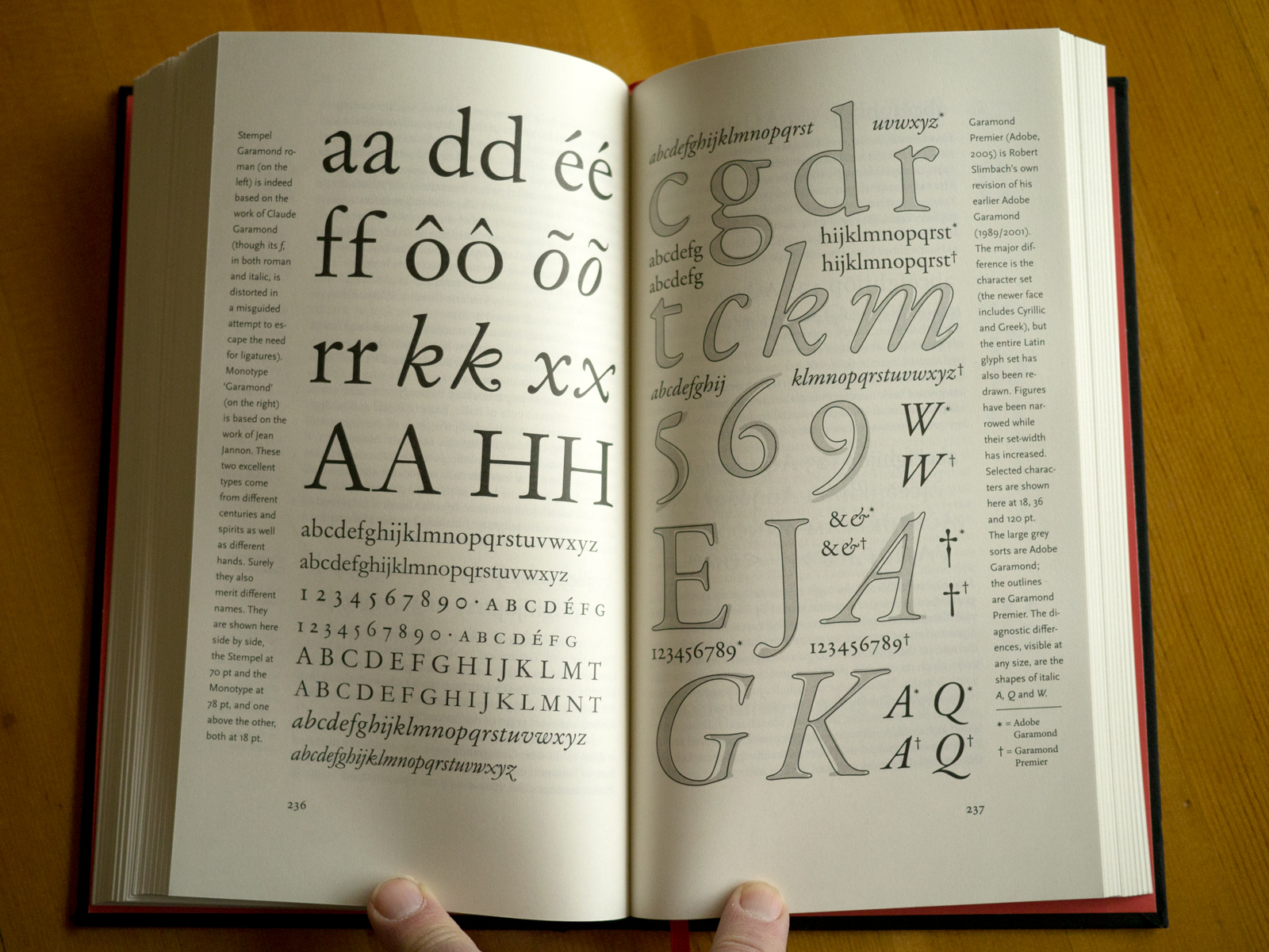
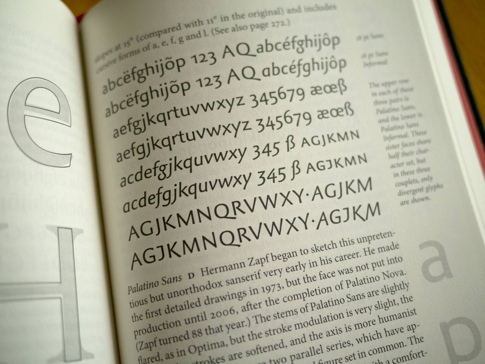
Bringhurst’s scope is wide: the fundamentals and finer points of macro- and micro typography, type anatomy and classification; choosing typefaces and page formats; the use of diacritics and other analphabetic symbols (no doubt his experience as a translator of languages that rely on extensive diacritical support in the Latin alphabet has sensitized him to these matters); annotated lists of designers and foundries; glossaries of glyphs and terminology; and more. Besides distilling centuries of typographic expertise, his treatment of it is remarkably thorough: he doesn’t pretend that his book is an exhaustive account of typography, but his care and attention to detail is obvious (in places even overwhelming). And all of it is supported by well-made illustrations and diagrams. It would be hard to find another writer in English who commands as much knowledge about the use of writing and print to capture language as Bringhurst does, and that he can condense it into 398 pages (in this edition) that many people will read (once more) from half-title to colophon is impressive.
The quality of Bringhurst’s writing allows him to pull this off. Knowledge, experience, judgment, and enthusiasm are not always accompanied by writing skill, and like many academic and quasi-academic fields, typography is not flush with talented prose stylists. But the fact that Bringhurst came to book design and typography from poetry is evident on every page. He is a gifted author used to making every word tell, and his prose is (to borrow Robin Kinross’s description from Modern Typography) “serene” and “incantatory”. He finds words that capture — more completely than practically any of us can muster — why typography matters. This is most simply and succinctly evident in “first principles”: “Typography exists to honor content.”
Finally, Bringhurst’s writing is a perfect match for his tone. The Elements of Style is actually a poor model for advice and guidance of any sort: Strunk takes an important insight (that writing should be as considered and economical as possible and appropriate) and worries it into dozens of ponderous, crabby, and often questionable commandments. Fortunately the similarities between that book and Bringhurst’s end with the title and the numbered divisions. Even at his most direct, and despite the fact that the book does have the feel and structure of holy writ in places, Bringhurst’s tone is moderate and reflective. His confidence never drifts into arrogance, and his traditionalist roots don’t prevent him from acknowledging that contemporary themes, subjects, and standards call for contemporary type treatments and approaches. Conservative, yes, but conservative in the style of Edmund Burke: you change what you must to preserve what you can.
None of this will be news to most readers here. But all this being said, is the arrival of a fourth edition of Elements something we should celebrate?
Bringhurst has probably taken a book grounded in print typography as far as it can go. But it is, still, grounded in print. It’s hard to believe that a book revised five times in the last twenty years mentions the World Wide Web exactly twice (if you’re willing to accept a mention of “hypertext” for one of them). And don’t look in the index for those passages, because “World Wide Web”, “web”, “webfonts”, “online publishing”, “internet”, “HTML”, and “CSS” don’t appear there. “E-books” does have two entries. “Linotype machine”, by contrast and with apologies to Doug Wilson for saying so, appears twelve times. (“Monotype machine”, in case you wondered, appears four.)
This doesn’t mean Bringhurst’s book is obsolete. After all, there’s no mention of the web in Lawson’s or Tracy’s books, either. Nor will you find any in the books of Jost Hochuli, Willi Kunz, Hans Bosshard, Carl Gerstner, Emil Ruder, Helmut Schmid, Geoffrey Dowding, Nicolette Gray, Daniel Berkeley Updike, Stanley Morison, Beatrice Warde, Jan Tschichold, or Eric Gill. And Giambattista Bodoni didn’t mention the Linotype machine, or even electricity. That doesn’t mean we have nothing to learn from them, that they don’t belong on the bookshelves of an educated typophile. There are principles of good typography that transcend substrates and technologies.
But all these books are products of their times and contexts, and we must read them that way, Bringhurst’s book included. The only new section in version 4.0 of Elements is a two-page examination of metal type (pgs 300–301). “To think about type”, he tells us to introduce the section, “you have to think backwards and forwards at once.” Well, yes — if you’re setting metal type. But virtually all undergraduate designers and typographers presently in school will never do that — in quantity, anyway, if at all. (It’s actually more likely they’ll set wood type.) That’s not to say that it’s a good thing they won’t, or a bad thing, simply that it’s true. So why do we recommend to them as a central text, as so many teachers and type designers do, a book that, for all its qualities, has an easier time thinking backwards?
Of course, students in any field involving typography should read it — must read it — but not first, and certainly not by itself. And not just because it’s grounded in a world of print. Display typography, which surely demands the same care that book typography does, is also nearly completely absent from the text. Even his consideration of type on the screen, smart as it is, is limited to two pages and five paragraphs.
More importantly and generally, though, and notwithstanding its range and depth and the generosity and precision of its advice, Elements is far better at exploring the meaning of good typography, at describing outcomes, than explaining process. The debates that brought us to what we value in good typography, the questions that remain contested, the actual means of translating principles into practice for students, are not here. And shouldn’t necessarily be. Bringhurst is the unofficial poet of typography, and a great one at that. But what I learn from Robert Frost is the meaning of woodcutting, not necessarily how to fell a tree or stack a cord of firewood.
The book isn’t without practical advice and we are fortunate that it delivers what it does. But unless Bringhurst plans a considerably expanded version 5.0 that focuses as much on web, mobile, and display typography as it does on the world of books, he should let Elements be what it is: a wonderfully written and wise summary of the world of typography as he found it. Surely others inspired by the world his text reveals to us, the beauty of his writing, and the thoughtfulness of his approach, can take it from here.


Thanks for this well considered and written review.
For me, I never considered Bringhurst’s book a bible. Among other quirks, the “historical interlude” chapter (does that persist in the latest version?) always struck me as straining to conform type history to canonical art history (my field of training), unsuccessfully. But you captured well what is not only useful but also, yes, beautiful about Bringhurst’s book. So, not a bible, but for me a gateway drug to typophilia and thus a treasured part of my bookshelf.
FWIW, my copy is version 2.5, which is not mentioned in the list of editions here.
Not only that, but doing another Google search–now that I know what to look for–I see there’s a 2.4 I missed as well, which suggests there are versions 2.1, 2.2, and 2.3 out there somewhere, too. My first copy ever was version 3.0, so I’m guessing that subsequent versions of the *second* edition would have been numbered inside the covers, not outside as with version 3.0 and up, because the only images in that range I can find say ‘second edition, revised and enlarged’ on the covers.
And yes, the historical interlude is still there.
While I agree that Mr. Bringhurst’s book is a tireless work of scholarly effort, I can never seem to get through more than a few pages before I get tired of reading it. Wish I knew what magic is seen in it by others. I have tried several times to read it but, frankly, it makes me feel like I am being scolded by an 18th century school teacher.
Is there any kind of disclaimer or forward in this new edition explaining the lack of content regarding web and display typography? If not then Bringhurst and his publisher owe such an explanation to readers, especially new and budding students of typography.
I love Bringhurst’s fluid and literate prose writing and his extensive coverage of the subject, and at the same time I think Elements is overrated for precisely the reasons given in Maurice Meilleur’s review. Leaving out display typography altogether is a glaring shortfall and testament to Bringhurst’s limitations as a typographer. This book in its first edition prompted Zapf to slap a spectacular label on it; had Zapf not dubbed it the bible of type, would it have been as successful? Given that Zapf’s interest in type design is mainly text faces it’s enough to wonder if Hartley & Marks paid him to say what he said.
Giambattista Bodoni lived from February 16, 1740 until November 29, 1813, passing on about seventy years before electrification of the Western world began. Linotype Machines appeared about the same time. (Source: Wikipedia) So it wasn’t Bodoni’s fault he never mentioned Linotype machines nor electricity.
The size of a content area and the positioning of glyphs within it varies from one browser to another. We’ve had 16 years of CSS and we still can’t put a single letter in the same place twice. Bringhurst ignores the web? Boo hoo. We ignored him first.
Lemme guess: He still says acronyms, even those in plural and/or possessive forms and/or involving punctuation and/or numerals, have to be written in small caps. (They don’t.)
And upon exporting those to XML, they appear as…?
The Elements of Typographic Style is a kind of Atlas Shrugged for gullible TypeTwits™.
This book certainly inspired me to look much better at typography, and it is definately well written. The information on diacritics, measurements and such is very helpful. However I do agree that its scope is limited to book typography. Web type is not in it, but also magazine, newspaper and display typography is missing. I would not dismiss the book because of this, but take it for what it is: A well-written book on classical (rather conservative) book typography.
He says they can be set in small caps to enhance the reading flow. For a prose text he is absolutely right. If you have acronyms in a prose text, a novel or a story, the stick out like a swollen neck. Ugly. Distracting. If you talk about scientific work, most professionals like those stickouts and use them to skip through the text.
As usual it’s a question of when to apply which style to which problem. Something Mr. Bringhursts continues to stress. No rule he spills in the book is sacred and to be considered holy and unbreakable. He just correctly says that you first need to know the rules and the reasons for them, before you should start breaking them.
Hartley and Marks just got back to me with the edition history. This one makes seven in total: 2.0, 2.4, 2.5, 3.0, 3.1, 3.2, and 4.0.
Robert Bringhurst sent Maurice the following email and granted us permission to post it:
Did anybody notice the changed style of the titlepage? Explicitly, in the words “Typographic Style”, the initial letters are set upright, the rest of the word being italic. That seems an unconventional combination to me.
Additionally, “of” is now very close to the following word. (Too close for my layman’s eyes.)
In book publishing this method of typesetting is not uncommon. Do you mean it is something you are unfamiliar with? Or merely that you disapprove of of it?
In a book devoted to typesetting, typography and typographic style that combination of forms is exactly what I would expect to see on the title page.
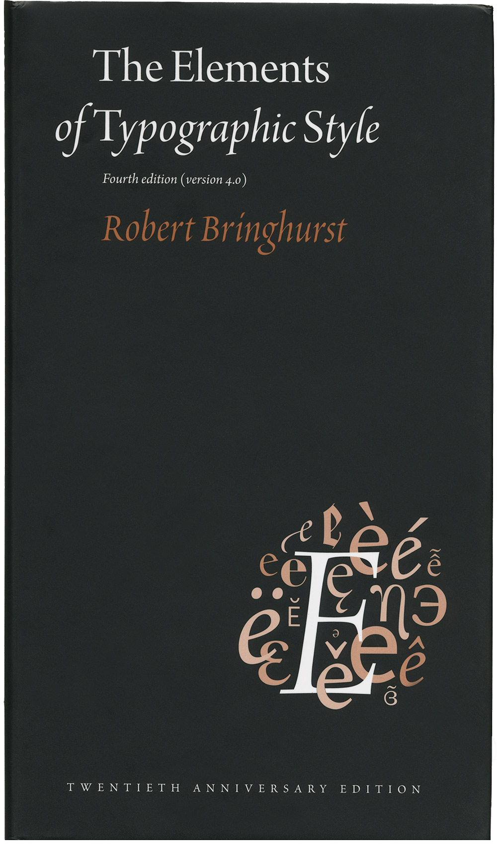
Surprisingly, the cover now has the title set in Minion Pro, instead of the more handsome Diotima Italic.
Bart — Nope. I really don’t think so. The cover of my second edition is all Minion, like the text on the pages. Did the third edition use Diotima on the cover? I’m skeptical because Bringhurst’s use of type follows the traditional conservative model. Serious books on typography use just one font or font family for reasons of stylistic unity.
Anyway, whether Diotima is more handsome than Minion is a matter of subjective opinion.
arbo — Sorry, I mixed up Alcuin and Diotima, both designed by Mrs Zapf.
In any case, the previous cover did have the title set in Alcuin, as is obvious here: http://www.amazon.com/Elements-Typographic-Style-Robert-Bringhurst/dp/0881792063
I think Alcuin’s calligraphic features infused the cover with a more poetic elegance. Certainly compared to the plainspoken grace of Minion Pro.
@arbo: Definitely “unfamiliar” – I think I am not in the position to disapprove of anything an established typographer does.
By the way, neither the roman nor the italic font in the title are Minion Pro. But it seems very close to it! Does anybody know what it is?
What do you think about the spacing between “of” and “Typographic”? I’m just curious why it was deliberately set so close.
The title on this cover is set in Arno Display, not Minion. The ‘l’ is an alternate. “Robert Bringhurst” is set in Poetica with an alt ‘g’. The book’s interior is still set in Minion and FF Scala Sans. (This is now cross-posted on Fonts In Use where you can find other examples of these typefaces at work.)
Okay, so what should a typography student read first?
Jez, some answers to that question can be found in this post on Typography 101 reading lists.
“Elements is far better at exploring the meaning of good typography, at describing outcomes, than explaining process”
Could anyone please recommend a book or source that focuses on the “process”?
“Of course, students in any field involving typography should read it — must read it — but not first, and certainly not by itself.”
This was, in fact, the first book I ever read on typography, and though I have read a great many more since, it remains the best.
I read Bringhurst for the first time in eighth grade, before I really knew anything about typography and when I was just starting to be curious about how books end up looking the way they do. It made a fantastic introduction. Lyrical, intelligent, engaging, puzzling and beautiful. I can’t think of a better first read on the topic.
I also applaud Bringhurst’s reluctancy to jump on the internet/e-book bandwagon when the field is still so young. I think any attempt to address typography for the screen in a practical way would weaken the book and date it far more than any of his print-oriented advice does. Digital technology changes so fast, and starting with the basics of typography for print provides a good background for people designing for screens anyway.
Print typography has been around for 560 years. When digital typography has been around that long, maybe it too will deserve — and give birth to — an equally thoughtful book.
I wonder if the new edition corrects the error in previous editions, viz. the old chestnut about spacing after periods. Bringhurst uncritically repeats the wives’ tale that a single space after each period is the one true faith, and that the idea of using more than one space developed with the appearance of the typewriter. One blog post that demonstrates his error:
http://www.heracliteanriver.com/?p=324
I learned a great deal from the blog above. It rejects the thoughtless practice of using two spaces after periods *as well* as the contrary dogma that more than a single space is errant vulgarity. Bringhurst’s book is a classic, but his history when it comes to this detail is completely wrong.
I believe the combination of upright caps and italic lowercase on the front cover is a reference to early Italics, where roman caps were quite common. It’s been some time since I read thoroughly about it, so correct me if I’m wrong: this was a Rennaissance thing.
Georg Trump’s Delphin, for instance, has similar roots.
Is the hardcover book sewn and bound? Not glued, right?
Yes, the hardcover book is sewn (and beautifully bound!). It also has a ribbon marker.
Can someone identify the face used for the title and author’s name (in caps) on the spine?
Micah, Arno is used for the spine. You can learn about the other typefaces used in the book at Fonts In Use.
I have a copy of the 2004 edition on its way to me in the mail. I’m curious whether there is any reason that I might want to try and grab a copy of the newest edition (for far less than the $700 I see it sold for in many places)? I’m also curious if anyone’s heard whether there will indeed be a 5th edition of the book? Ebooks seem to have matured quite a lot since 2013, and I even see that an edition of Elements is available in ebook now (though I’d really prefer a print copy myself)
If you’re willing to pick up a used copy, you don’t need to spend $700 for the 4.0 edition. Currently, there are eight available on Alibris and three on Biblio for $100 or less.