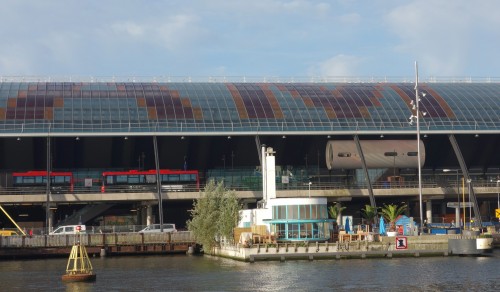
Behold this “artist impression” by Benthem Crouwel Architects of the glass roof on a new bus station behind the Amsterdam Central Station, currently under construction. The vast, curved roof is adorned with the word AMSTERDAM in large red-with-orange letters.
Click images to enlarge.
Building commenced in April 2011. Today, in September 2012, the middle section of the roof is still missing, so all we can see is AM…RDAM. (The letters STE won’t be inserted until 2013, when construction of the underground North-South tram line at this location is expected to be finished.)
Being worrisome by nature, we typographers can’t help expressing some concerns: did the architects and roofers calculate everything exactly right? Will the missing letters fit into the remaining space? And did the roofers adhere to proper kerning specifications?
Fact: the word AMSTERDAM starts and ends with the letter combination AM.
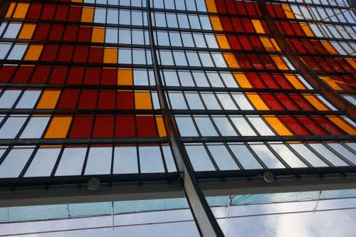
The first worrisome fact: the space between the first A and M is five windows …
… but between the second A and M – oh, horror – it is only four.
AM 1: five windows (close-up)
AM 2: four windows (close-up)
In addition to this internal kerning error we must point to a possibly even more worrisome fact. The distance from the word AMS… to the left side of the roof is forty-nine windows …
… whereas to the right side of …DAM we count only forty-six. The word AMSTERDAM will therefore be out of center by a margin of one or two “window pixels”. Or even more so, because the first letter (A) is skewed on the left side while the last (M) has a straight edge. It would have been wise to leave more space, not less, at the right-hand side, for the word to be centered properly.
Oh, well.
Piet Schreuders is a designer, writer, and researcher, living and working in Amsterdam. He founded and publishes Furore magazine, the cat-fanzine De Poezenkrant and is author of “Lay In – Lay Out”, “The Beatles’ London”, “Paperbacks, USA”, and “The Paperback Art of James Avati”.


So, does the current actual placement of the letters match the one in the artist’s impression?
I love the geekiness of this article.
All that matters is that they will have to face “RDAM” ’till 2013…
This wouldn’t have been a problem if they had used sub-window antialiasing.
In the old day of “fly by sight,” usually in small airplanes, your “GPS” was follow the train rails and your “location servicies” were the name of the railroad station/city written in the roof.
So, you still can flight by sight and know that you are in Amsterdam!
“Window pixels?” surely…..Wixels!
I love Schreuder’s work and his attention to detail, but anyone who’s worked on jobs of such a large scale, knows damn well that a one window “gap” is nit-picking. Take any hinting job and you’ll see exactly how “even” some spacing decisions have to be made: pixels are being sacrificed all the time for the sake of the general balance of the wordspace.
For the sake of completeness, why not give Benthem Crouwel Architects and the typographers a chance to have their say, too?
Went back to check the aritst’s impression. It appears that the actual placement does not match the sketch exactly: the drawing shows 47 windows, not 46, to the right of -RDAM.
The left margin can’t be checked as it is lost in an artistic haze.
I request the measures of the windows to be taken. Do they all have the same widths? There is no way of telling if the word will be centered if we don’t have an exact measure of the singular windows, I’m afraid.
You can see read some reactions by the creators in this story on nrc.nl.
Great idea, bad execution…
Just been at Amsterdam station: it’s great! The windows/pixels are soo large, that, at first, you berely figure those are letters. Well, I’m not going to fly above that roof anytime soon, and Mr Schreuders neither, I gather.
The metal beams supporting the roof are interfering with the pixels, that’s a fact – so I can’t agree with Mr Schreuders’ who wants to convince us of the contrary. Apart of the sensation-seeking tone of this piece, I’m surprised how easily the digital world bashes a good piece of work, only because a designer known for doing printing matter seems to have gotten the itch for counting pixels and measuring monumental pieces with the same ruler.
The nrc article is even more pitiful, stating the type is skewed. Oh well, it’s not skew, it’s straight, and gives Amsterdam the typographic wow-factor of the most designed country out there. Not convinced? Come over!
Whoa! I never claimed that there is no interference between roof beams and windows. That was a point raised by others (in the nrc.next article mentioned here earlier); an irrelevant point because the word AMSTERDAM is clearly meant to be read from outside the bus station (and at some distance at that), not from the inside (where the word is not readable anyway).
I do like the design. My piece merely raises some small typographic concerns, possibly prematurely, and hopefully wrongly.
What is relevant to me is the sheer fact that, at the distance you show the station roof photographed, if one ever gets there, the human eye cannot distinguish that grand imprecision. At that scale, my eye focusses on one point at a time, and then rolls on to the next point. I assume yours, too. And, if it comes to that disputed math precision, is symmetry per definition make it a better design? the difference between a cover title and ambiental typography at a scale of one to thousands would be that that one window equals to about a millimeter, maybe less. That brings the whole issue down to a typographic feuilleton.
BTW, NS had been refurbishing quite a few stations across the country lately, with some of them carrying true typographic disasters worth documenting.
… funny that the gap now leaves the two words ‘am’ & ‘rdam’ (an abbreviation for rotterdam…) (Read more…)
I agree with Piet Schreuders. If you are going to do something, do it right. But then again, according to Edith Piaf, its the imperfections that make us great. Is God in the details, or the devil?
We can only hope that the “ster” will fit.
I don’t think there’s anything to worry about, because if there is a error, one wouldn’t actually spot it unless you were really high above the whole word of Amsterdam, thus the eye sees the word in it’s entirety for example if one was in a helicopter or airplane. For most people at ground level one would only see part of the word thus not spotting a error (if there is a error)
I just went to station and I am shocked at how tacky the entrance looks. Can you tell me if this is a temporary thing? And inside, all I can see is a muddle of passages leading to platforms and many horrible cabin sized shops. Where is the original station? I am looking for pics. Perhaps I have been spoiled by the amazing recent renovation of the beautiful Saint Pancras station in London. Please tell me that Amsterdam Central will be restored faithfully to its original state. Thanks.
[…] Centraal Station Die allergrößte und längste Beschriftung der Stadt ist einem Entwurf von Erik Vos und Fred Smeijers. Sie befindet sich am gläsernen Dach der neuen Bushaltestelle, parallel zum Centraal Station, auf der Nordseite zum IJ. Lese hierzu auch die kritische Bemerkungen von Piet Schreuders auf Typographica. […]