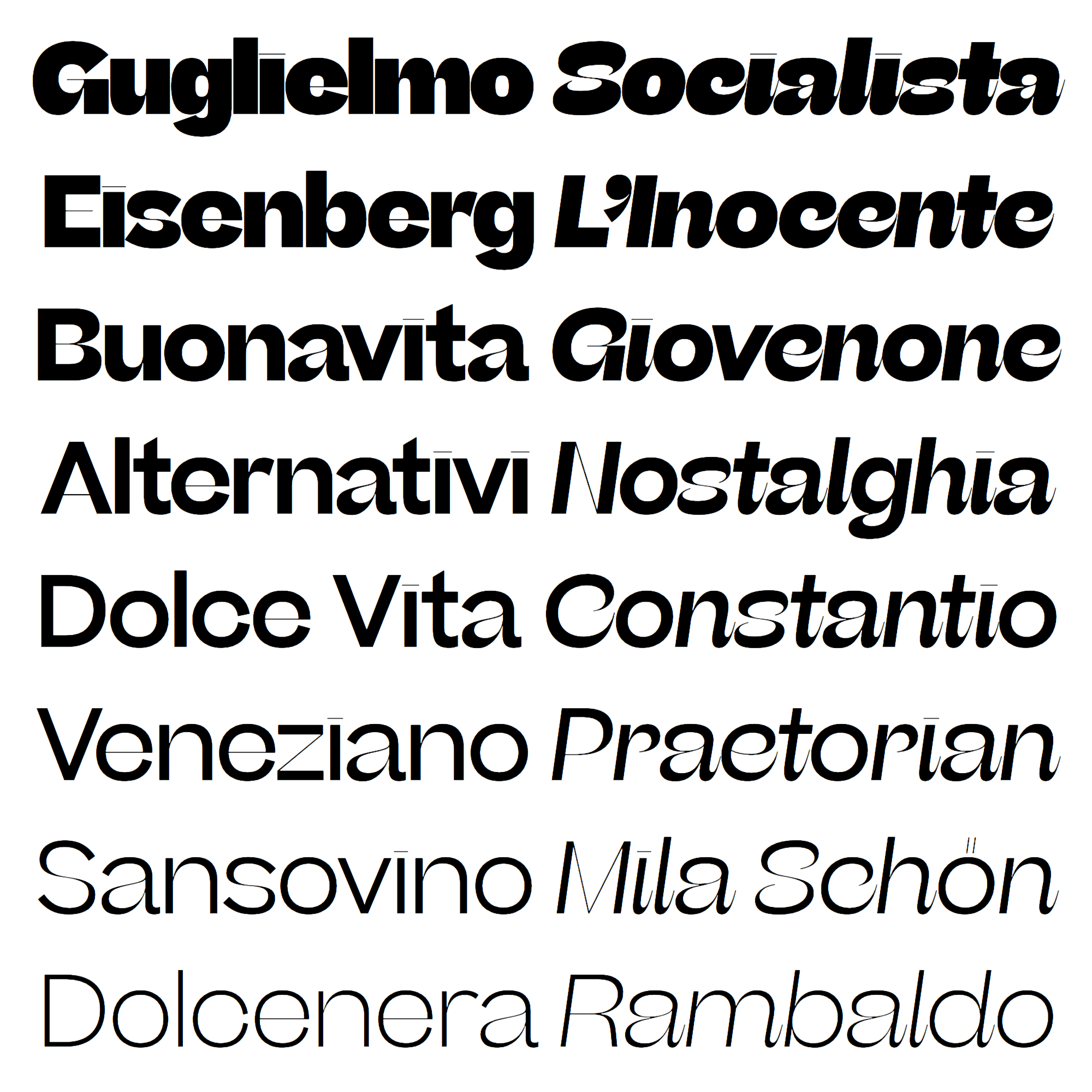
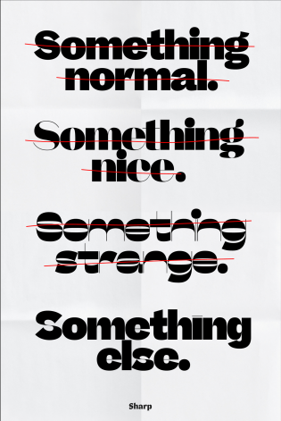
Beatrice Display is wrong. It has too much contrast for a grotesque, but not in all of the glyphs. Moreover, the thin strokes are not in the right spots and the contrast is all over the place.
Sharp Type’s new display face doesn’t strictly follow any historical model or contrast construction, and it doesn’t hide that fact. In fact, it embraces it. And that’s why I love it so deeply.
Type design can seem like a conservative field, where experimentation is necessarily limited: how much can you distort/modify the shape of an a and still recognize it as such? The truth is that a typeface’s identity rarely lies in the design of a single glyph but rather in the texture and rhythm created by the sequence of letters, words, paragraphs. And this is where Beatrice Display, with its super-tight spacing, is at its best.
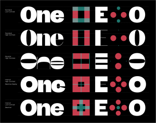
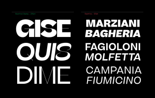
Lucas Sharp came up with a very distinctive recipe to design its alphabet: he used the skeleton of an American grotesque, with its closed counters, and applied high contrast in a very original but scientific way. The thin strokes are long and visible, but not where you might think you would find them. Some follow hints of inverted contrast (as in the S), contributing to an overall sense of quirkiness; some are more traditionally placed at the joints (see the lowercase n and a); others are simply not there (see the uppercase D, O, and C, for example).
Sharp also applied the more rigid roman’s approach to the softer italic. Following the skeleton model, it’s not a proper italic with cursive construction, but the high contrast and some soft details of the roman are pushed forward, adding calligraphic hints of entrance and exit strokes.
This rigorous but versatile system allowed Sharp to explore uncharted territory and to design a typeface that is functional but has a strong personality — or maybe it’s the other way around. Anyhow, a sort of holy grail.
PS The description of Beatrice Display notes: “The typeface is dedicated to its designer Lucas Sharp’s mother, Beatrice Benjamin, who continues to seek beauty, embrace originality and has never let convention hold her back.” Now I want to meet the real Beatrice!
