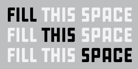
Alexandre Saumier Demers and Étienne Aubert Bonn founded Coppers and Brasses in 2012, but they didn’t release a co-designed typeface until 2014, when they published Martha. Double is their second joint design.
The concept is simple: adding width and weight simultaneously. The narrower style is the lightest and the wider style the boldest. Instead of going crazy with middle weights, Alexandre and Étienne decided on a small number of styles, which makes the steps between weights / widths bigger and more noticeable. It also makes the different styles have distinct personalities, while still belonging to the same family.
Alexandre and Étienne also do sign-painting work. For me, when I first looked at Double, I found that it had a certain sign-painting quality. I asked them if the typeface derived from one of their jobs painting signs and it turns out that the inspiration for the face came from an old painted sign in Montréal.
Figures and other characters that go beyond A through Z can sometimes be a bit neglected in a design. I don’t have this feeling about Double; in fact, it was when I saw the figures and the ‘&’ that I completely surrendered to it.
I don’t want to sound too much like a fangirl, but all of Coppers and Brasses’ work is pretty awesome, and if you haven’t checked it out yet, you should! Apart from type design, they also do lettering and sign painting. And from what I have seen from their personal sites, their graphic design game is also on point.
It is wonderful to see young designers starting new foundries, being very good at it, and taking their work seriously — all while allowing themselves to be playful.
Big shout out to Coppers and Brasses! 🎉


