
Just when you think you’ve seen it all, a typeface comes along that turns your expectations upside down. With Faune, commissioned by the Centre National des Art Plastiques, Alice Savoie integrates unlikely visual cues into a type design.
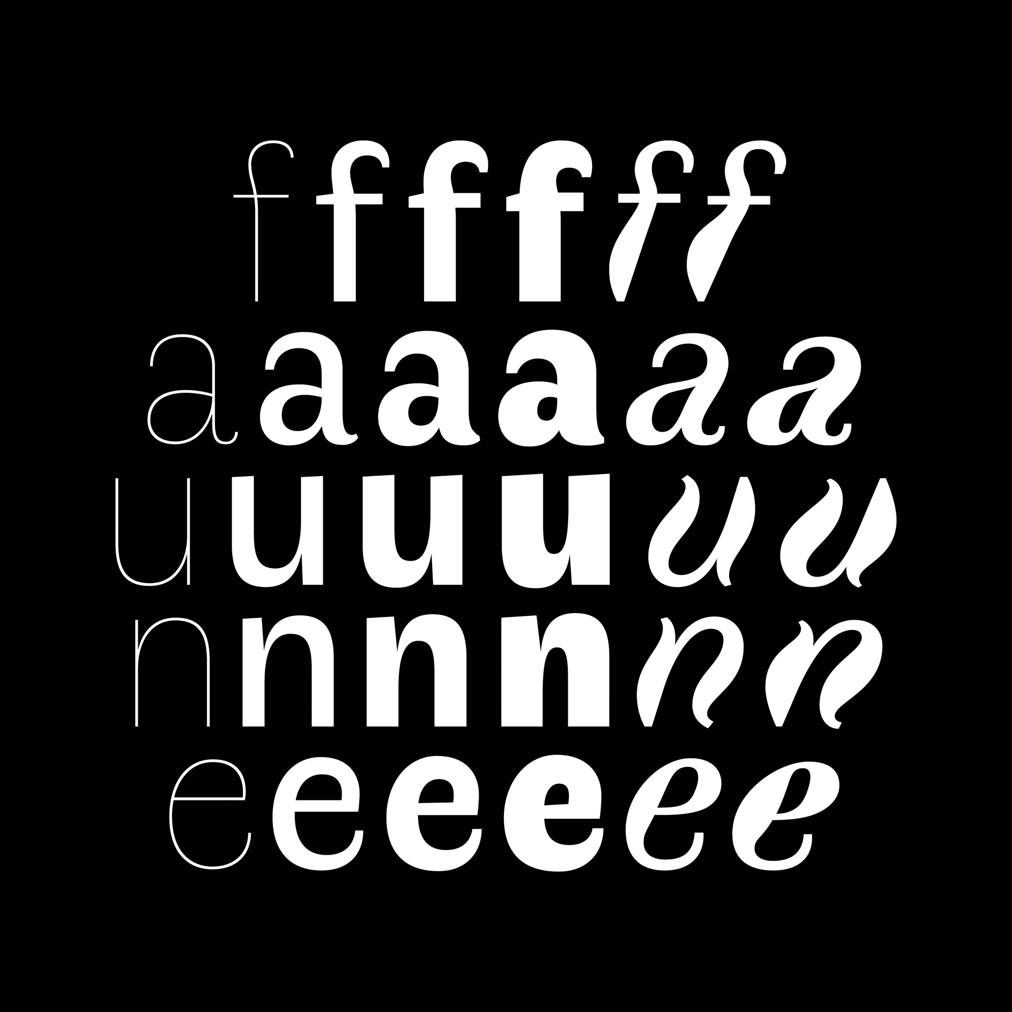
Savoie took engraved depictions of animals from two late eighteenth-century and early nineteenth-century scientific masterworks as points of reference. The viper informed the lithe, almost weightless Thin style, which became the skeleton for the family. The ram, with its stocky body on slender legs, spawned the Black style, which carries echoes of nineteenth-century grotesques in its contrasted letterforms. The most surprising style is the Bold Italic, inspired by the undulation of a ibis’s neck and the contrast between its heavy body and skinny legs. Starting from these three Display variants, Savoie developed a Text Regular, Italic, and Bold.
Even with all of the innovations in contemporary typeface design, one might expect some basic concepts to be set in stone — like what constitutes an italic, for example. Savoie, however, offers a wholly unexpected and fiercely original interpretation, a sinuous hybrid of slanted roman and true italic. The letterforms achieve a breathtaking fluidity, a term often used to describe typefaces but never conjured quite so literally.
Savoie’s novel approach has resulted in a superb, surprising typeface that is anything but a novelty. Faune’s contrasted sans serif letterforms are not precious, but reliable and good-humored. They look surprisingly subdued in smaller sizes, making them supremely useful for such an innovative design. By only providing a limited set of well-considered styles, Savoie challenges users to rethink the contemporary paradigm that type families need to comprise an extended range of weights and widths to be serviceable.
Faune is a minor masterpiece that begs to be discovered, a gift to contemporary type design. This can be taken quite literally: since the typeface is available under a Creative Commons CC BY-ND license, it can be freely downloaded and used in both personal and commercial work.


A beautiful (and free) typeface. I love how the letterforms change due to weight. A minor gripe though: I don’t find the font very usable, especially if you are going to use the italic. To me, the italic looks like a malformed water balloon, too high-contrast and wavy for long pieces of text. It may provide emphasis, but too much emphasis makes things look gimmicky. All in all, I would have much preferred a slightly toned-down version of the italic for text use.