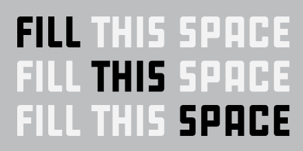
Maelstrom is one of the most sickeningly exciting typefaces I’ve seen in a long time. It makes me want to punch someone in the face — which sounds bad, but it’s actually good, like “Oh, you asshole!” POW “That’s too damn great!”
It’s what’s known as a “reversed-stress” typeface, which means the parts that are usually thin are thick and vice versa. It’s based on some early 19th-century letterforms, but takes them further, with more extremes between thick and thin, which increases its kinetic energy: that’s the sucker punch. The ‘A’ alone is like a man riding a locomotive, the ‘N’ looks like Thor’s hammer just slid off its pedestal, and an abundance of triangles, notable in the ‘E’ and ‘F’, gives the face a delightful geometric abstraction that could, if used wittily, lead to some fascinating illegibility. Pedants may wonder what it’s for and cite “limited use”, but I assume they’d be those who think that type is for reading, without an eye to its potential for graphic intrigue and mind expansion.
A typeface like Maelstrom should be an essential in students’ toolboxes to use, experiment with, and observe the construction of space; to help them break the mold of the familiar, and to understand that there’s more to using type than making words.


[…] appreciate and adore Maelstrom and its wacko Italian Futurist approach to reverse-stress letterforms, with the historically […]