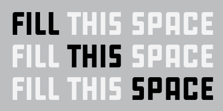
Mazagan was inspired by a French typeface family called Marocaines, originally published during the Belle Époque — the golden age of the late nineteenth century characterized by excitement and buoyancy, along with visual expressions of flowing lines and references to luscious botanical structures. I love it when type designers are willing to take on a historical typeface influenced by previous aesthetic preferences and turn it around, emphasizing what makes it stand out.
Marocaines was designed at a time when the industrial revolution was jump-starting consumerism with advertisements announcing the new prosperity of luxury and common goods. Mazagan is likewise intended to be used as a display face; it flaunts some interesting details that were retained from its original inspirational source, while others have been toned down. One of the preserved and most eye-catching details in Mazagan is the unexpected reversal of stem angles, going against common letter-construction principles. It’s a detail that could have been “corrected” — and yet I’m inspired by Mário Feliciano’s decision not to go this route. The mirrored ascending stem endings contribute to ups and downs, which in turn create their own flow pattern. This feature is further emphasized on the x-height by lowercase curves that barely touch when going off verticals, creating cavernous nooks that rhythmically play together with the stem inclinations. No less important are Mazagan’s lowercase of a uniform width (which yields a stable rhythm) and its slightly incised stems (which exude an air of subtle elegance).
I favor many details about this quirky typeface, mostly because they were preserved as opposed to pared down. The success of this design lies in its refined equilibrium of flamboyant letterform features, a hallmark of this sort of type.

