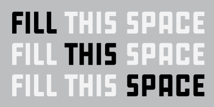
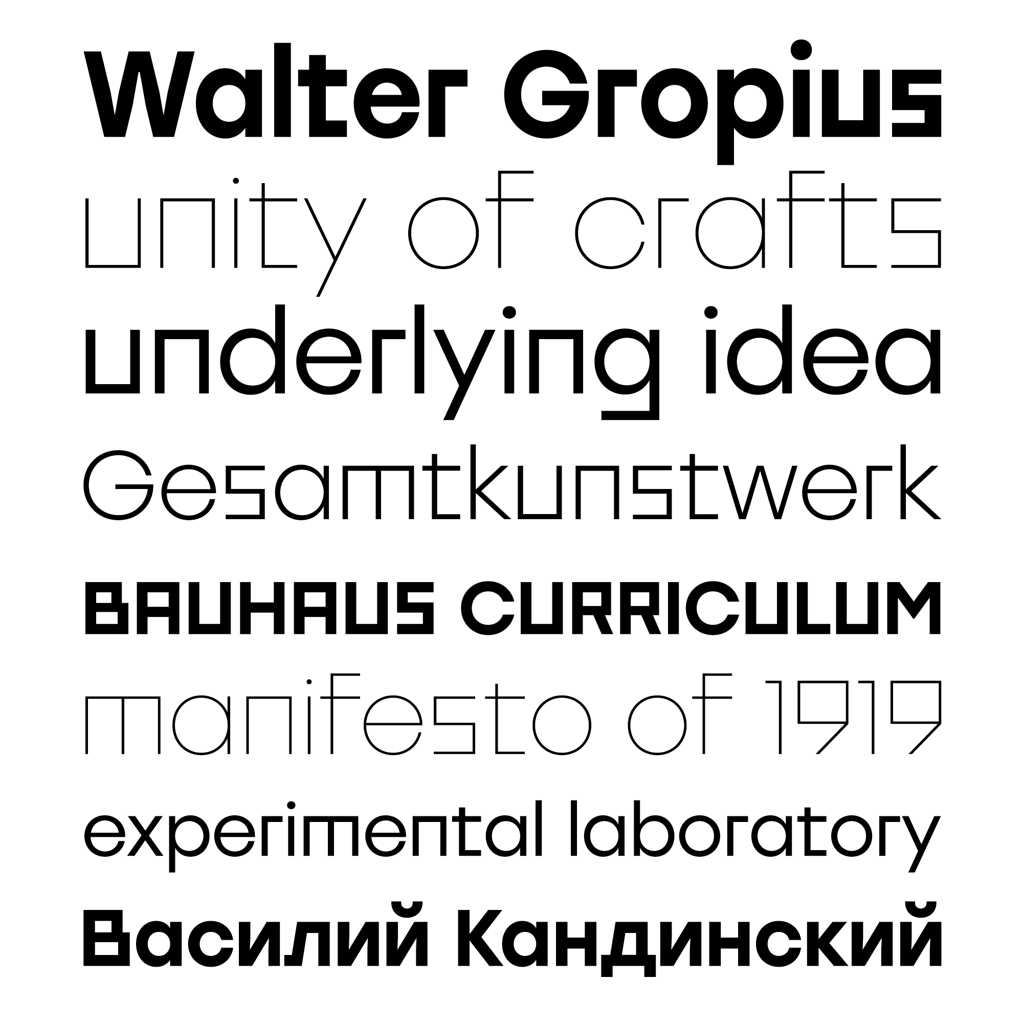
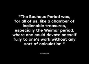
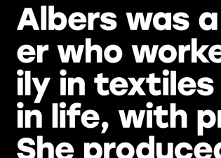
Stolzl Display is angular movements turned into type, the Bauhaus ideal turned into letters.
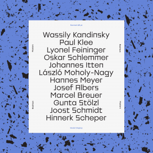
Clear shapes, no ornament, keeping designs as simple as possible: basic Bauhaus rules were adjusted to design this typeface. Stolzl Display is dedicated to the memory of Gunta Stölzl (1897–1983), one of the few female Bauhaus master artists with far-reaching influence. She was the first female teacher of weaving at the Bauhaus Dessau and later became the director of the weaving workshop.
Stölzl developed her own designs, carpets, and textiles, as well as woven covers for furniture by her Bauhaus colleague Marcel Breuer. In 1928, she travelled to Moscow and attended the Russian art school Vkhutemas. Here is a connection to the typeface and its designer, Mariya V. Pigoulevskaya, rooted in graphics, illustration, and the Russian language. Also, Mariya is “passionate about the Swiss style” that Stölzl contributed to: she left the Bauhaus in 1931 for Switzerland and founded the handweaving company S-P-H-Stoffe in Zurich (with former Bauhaus members Gertrud Preiswerk and Heinrich-Otto Hürlimann). Stölzl’s works are to be found in museums in Basel, New York, and Cambridge, Massachusetts, among others. Find out more in the book Gunta Stölzl: Bauhaus Master — and just look at the cover to get an impression of her aesthetic. It leads directly to Stolzl the typeface.
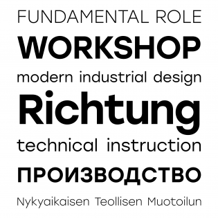
Stolzl Display is a strange combination of strong and somewhat bulky, straightforward forms (no subtle curves or ornaments) contrasting with an astonishingly harmonious overall impression. Designer Mariya V. Pigoulevskaya aims at capturing the original Bauhaus idealism; obviously she is committed to their experimental, conceptual approach. It works. The resulting letterforms are characterized both by an air of nonconformity and a well-balanced self-esteem, it seems, losing neither their playfulness nor a certain jaunty, boisterous impact. The font family is meant for headlines, titles, and subtitles, Stolzl Display being the first subfamily to be released. It comprises six weights, 480 characters, alternative glyphs, and OpenType features.
A special mention goes out to Stolzl Display’s Cyrillic. Whether it’s that the Bauhaus design concept works tremendously well with Russian and/or that the designer’s cultural background comes to the fore, the Cyrillic glyphs are an extremely pleasant surprise. They appear so self-evident, so matter-of-fact. They just look natural. (Is “natural” a proper term to use for Bauhaus style?) Reading the Cyrillic seems to work well (I’ve been told), whereas the Latin letters need some getting used to: you stumble, tripping on the edgy forms. You are irritated maybe, and challenged. Which is not the worst effect of art and (type) design (at least with display fonts).
The only thing I regret is the fact that the designer chose to skip the umlaut in Gunta Stölzl’s name and call the typeface family Stolzl. Even with the umlaut turned into an “oe”, it would have fitted much better (not so nice, perhaps, but halfway correct). “Gunta” would have worked perfectly, both in its sound and its uniqueness. (I’ve never heard of a woman or a typeface named Gunta.) Also, Stolzl in German is close to the word “Stolz” (pride, boastfulness); but the ‘l’ at the end makes it sound like a diminutive to us. But then naming is an adventure in itself …
Nevertheless, viel Glück! Hopefully both Gunta Stölzl’s work and Stolzl Display will continue to gain attention.
