Archives are ambivalent places. They promise access to endless knowledge and information — but retrieving it, as most type designers know, can be difficult.
The FACIT Model opens the gates to a specific archive that has barely been explored until now. It represents meticulous visual research into the ephemera produced between the 1950s and the 1970s by the Swedish typewriter and office machine manufacturer FACIT AB.
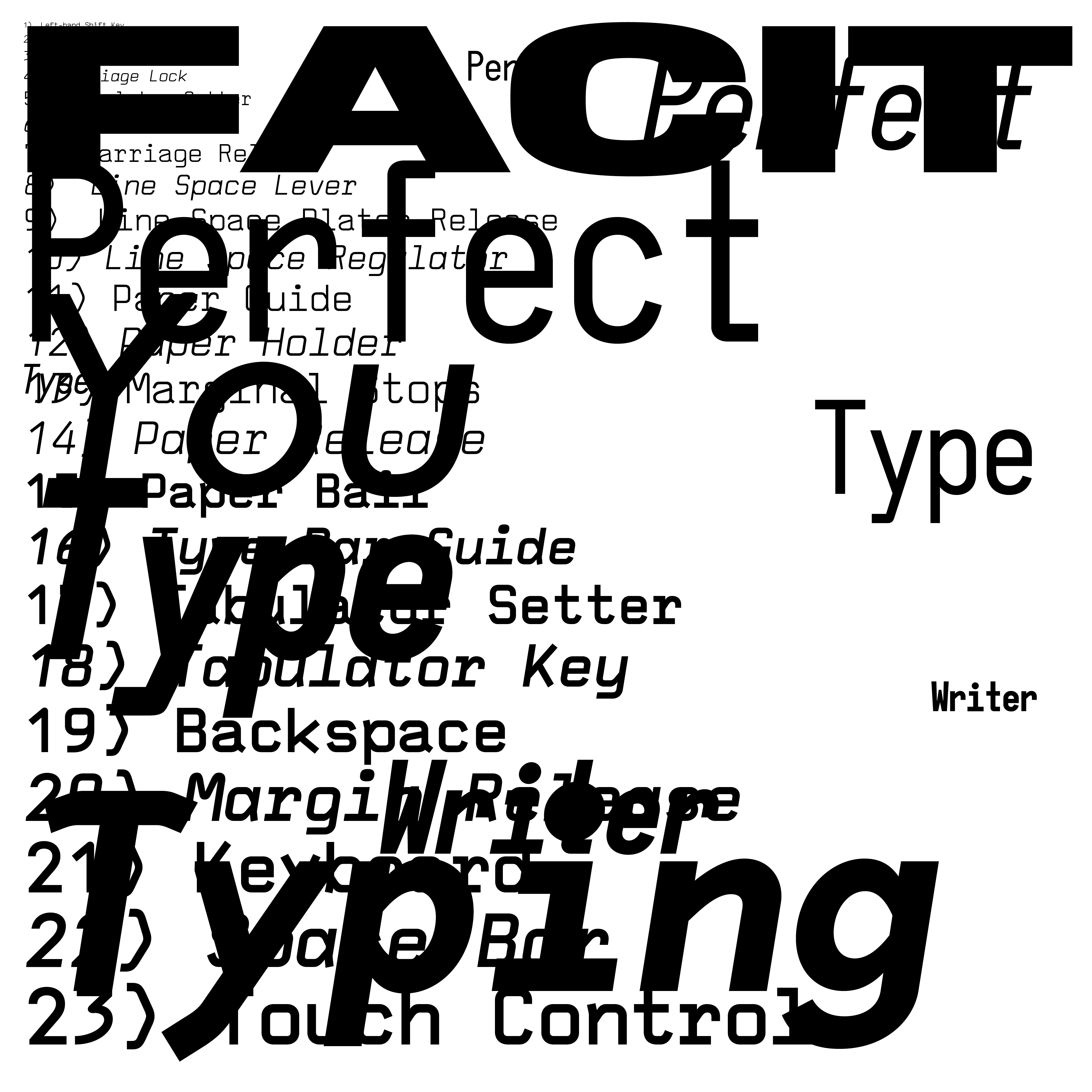
Our Polite Society Type (Jens Schildt and Matthias Kreutzer) examined the material for four years and gathered it into a beautiful type-driven publication that is rich in additional texts and imagery, and features a specially designed series of four unique typefaces: Favorite, Placard, Cubic, and Facitype.
Schildt and Kreutzer have approached the collection in an editorial way: each style has its own specific voice, atmosphere, and function. The care and love for printed matter is vastly present in every detail of the letters. While some shapes are rather rough and sturdy, they create text images that are very pleasing overall. Observing the shapes becomes a fun exploration, since they display many exciting and unconventional details. The forms of OPS Cubic, for example, remind me directly of paper clips.
Typefaces are tools that rely heavily on their context. At the same time, they function as visual signifiers, displaying and accumulating information through their history, usage, and adaptation to new technology. By contextualizing the typefaces in a publication and several exhibitions, the FACIT Model becomes a time capsule. The project links typography, design, history, identity, and life.
These revival typefaces were taken out of their typewriter machines and can now live on in a new digital context. For the first time, they are free-floating and can be used in new environments.
No archive can ever be complete. Neither is this collection. That’s the beauty of it. As a viewer, as a reader, I long to see more of this world.