

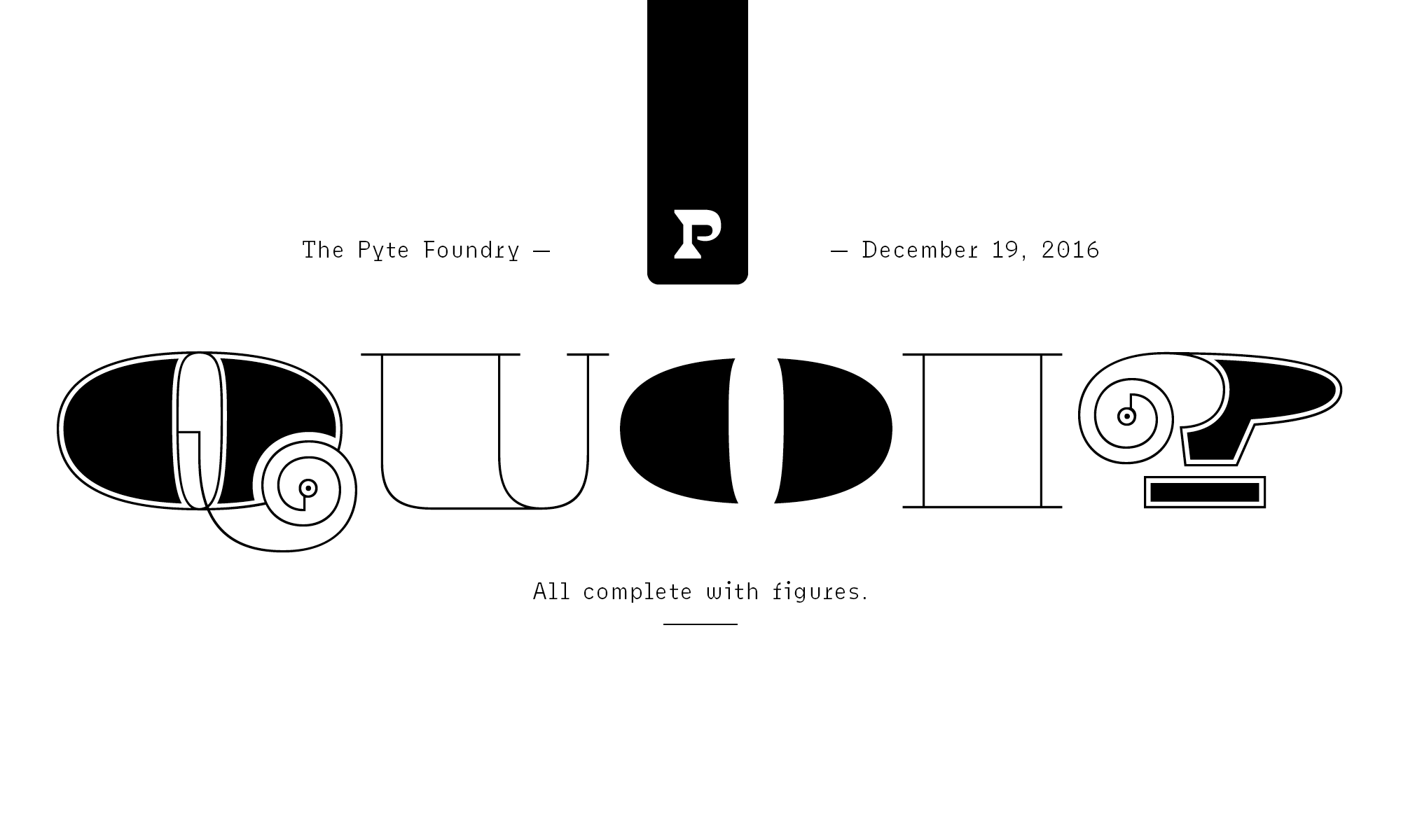
This is not a typical typeface review. It’s a review of a whole foundry. I don’t know why I took it upon myself to review fifty-two typefaces instead of just one, but I feel it’s necessary to review them together. These fifty-two typefaces gave me much joy in 2016, and I want to give some of that back to their creator.
The Foundry
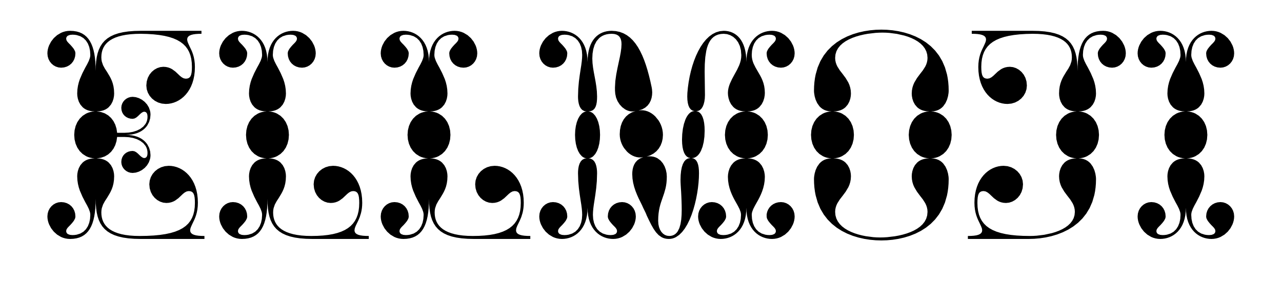
Stefan Ellmer (also known as Ellmer Stefan, following the Austro-Hungarian name order) is an amazing designer. Thanks to his contributions, 2016 was a special year for type.
In late 2015, Ellmer set out on a quixotic journey: he decided to release a new display typeface every Monday in 2016. And thus The Pyte Foundry was born.
An ambitious goal! But not only that. The Pyte foundry operated according to the following rules:
- Every typeface was a new creation, or at least a novel interpretation of an existing idea.
- Every typeface was available free of charge.
- Every typeface was available for one week only.
I was hooked from the very beginning (and I was not the only one). Every Monday, the first order of business was to download the latest Pyte release. No matter how weird the design, it was mandatory for type nerds to have it — and Pyte rarely disappointed.
Workflow
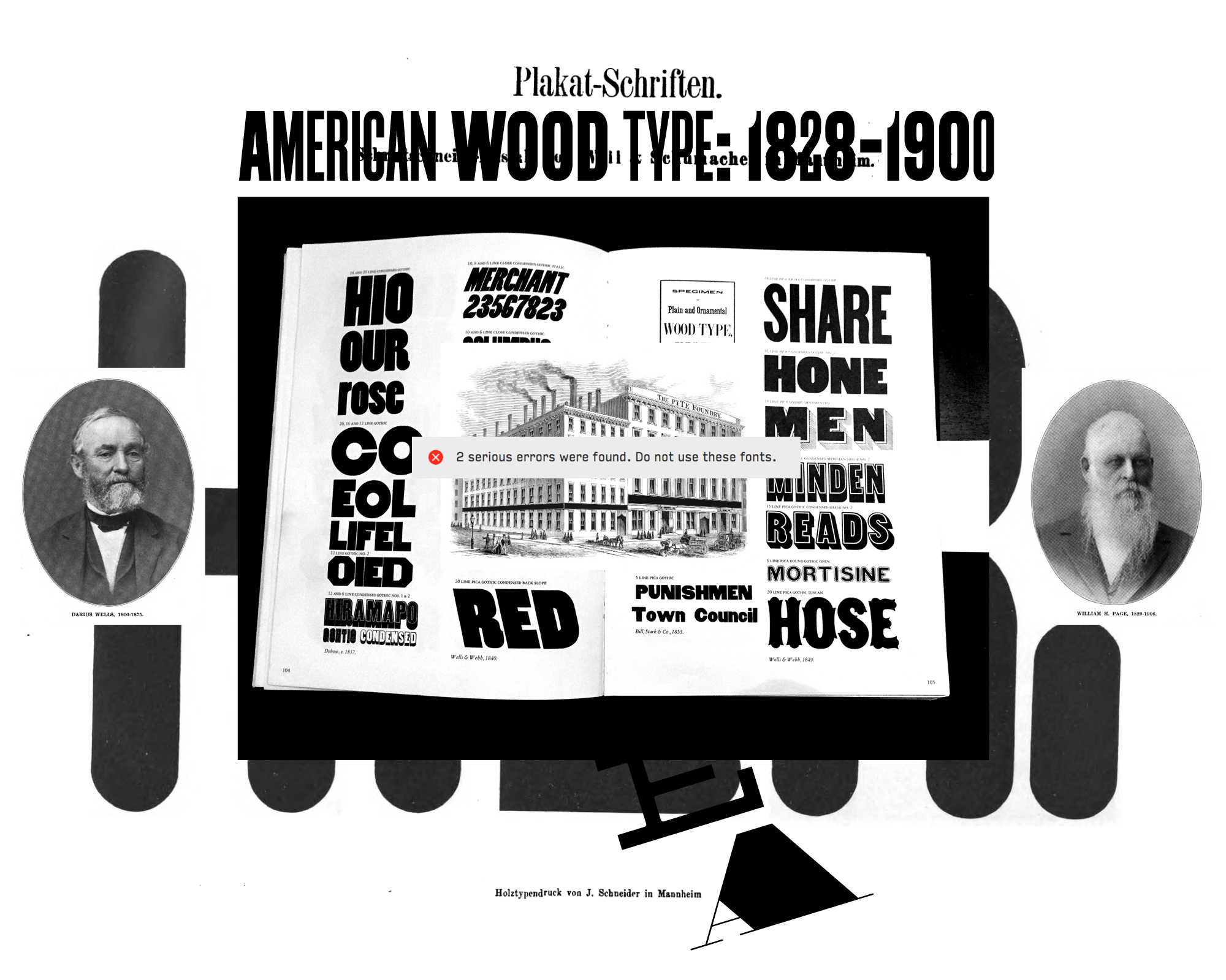
Ellmer knows that drawing type takes time, usually much more than seven days. To reach his goal of releasing a weekly typeface, he devised a system that makes heavy use of components. Flipping, rotating, and scaling simple shapes can produce amazing results in relatively little time — the alphabet, after all, is a modular system. As Ellmer states on his website, the process is not new: William H. Page used a modular approach for producing wood type in the early nineteenth century. (One feature not found in wood type is nested components, which allow a simple shape to be used to build more complex shapes, which in turn can be reused to create even more intricate ones.)
Ellmer told me that his friend Johannes Lang encouraged him to use this workflow on a grander scale, and Lang is credited for helping out with “Python-powered transformations” for various releases. Reflecting on the experiment, Ellmer sees many more “Pytography” possibilities:
In the aftermath, I even feel that I did just scratch the surface of that component-based approach — massive potential still to be realized. I guess at some point I will revise the setup…
Design modules lend themselves mainly to uppercase letters, which are more uniform than lowercase letters. That’s why most Pyte releases either contain only capitals, or use the lowercase slots for cap alternates. In my opinion, that is a totally legitimate approach.
The Releases
- Prhyme. A wide, monolinear sans. Typical wood-type proportions and feel, but not slavishly so (there are overshoots, for example).
- Alcove. A split serif with classical proportions. Bifurcated, somewhat airy, and elegant.
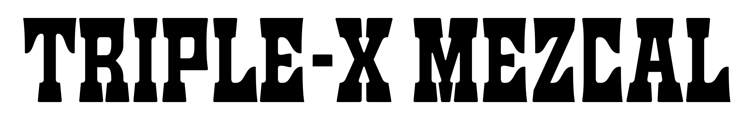
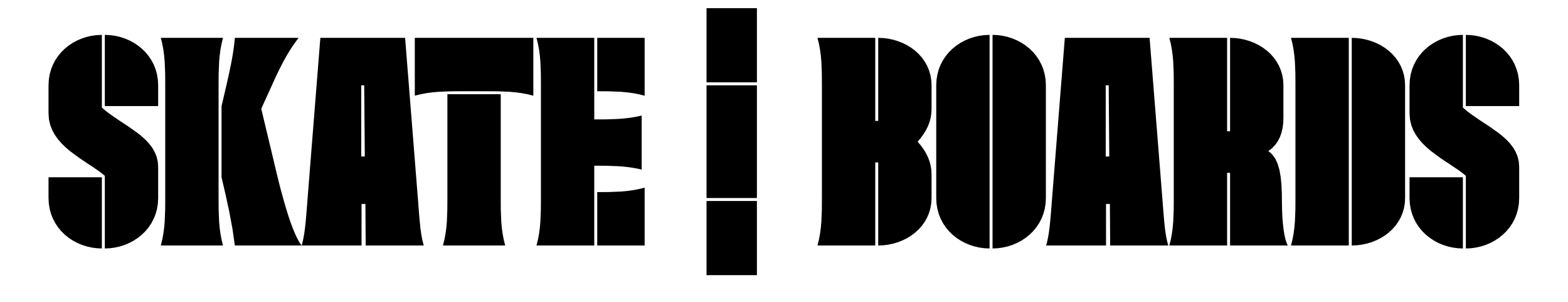
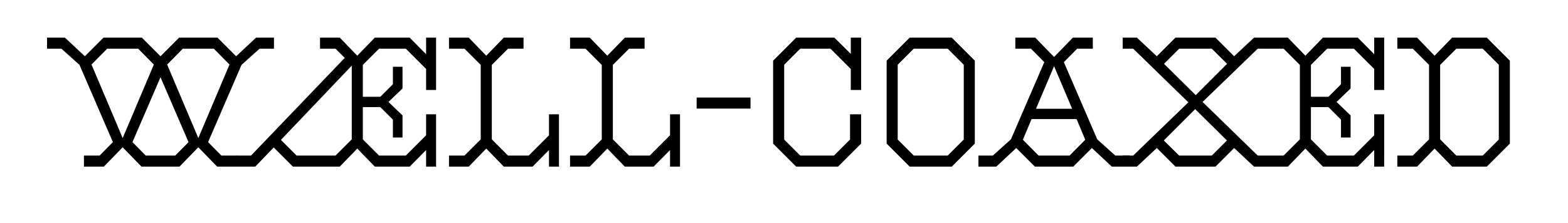
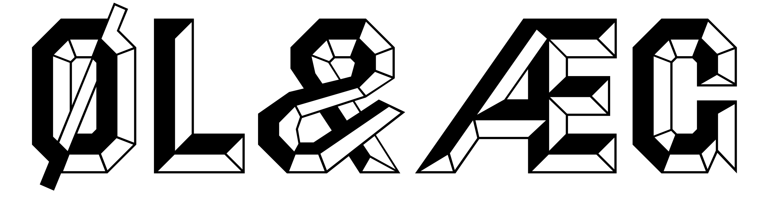
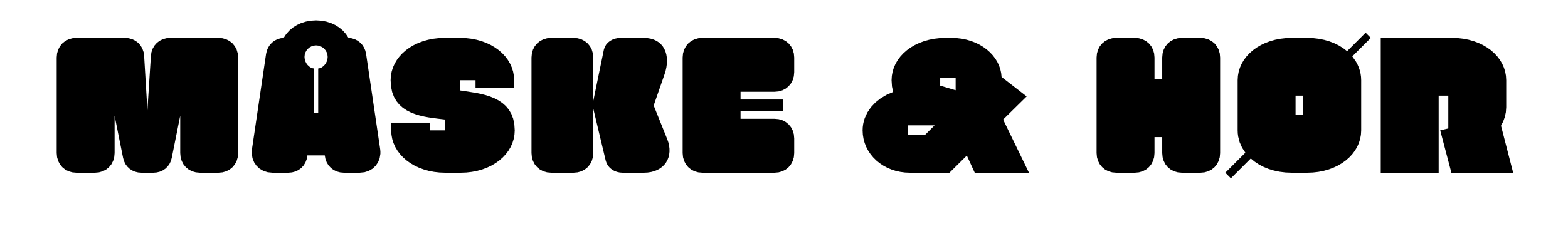
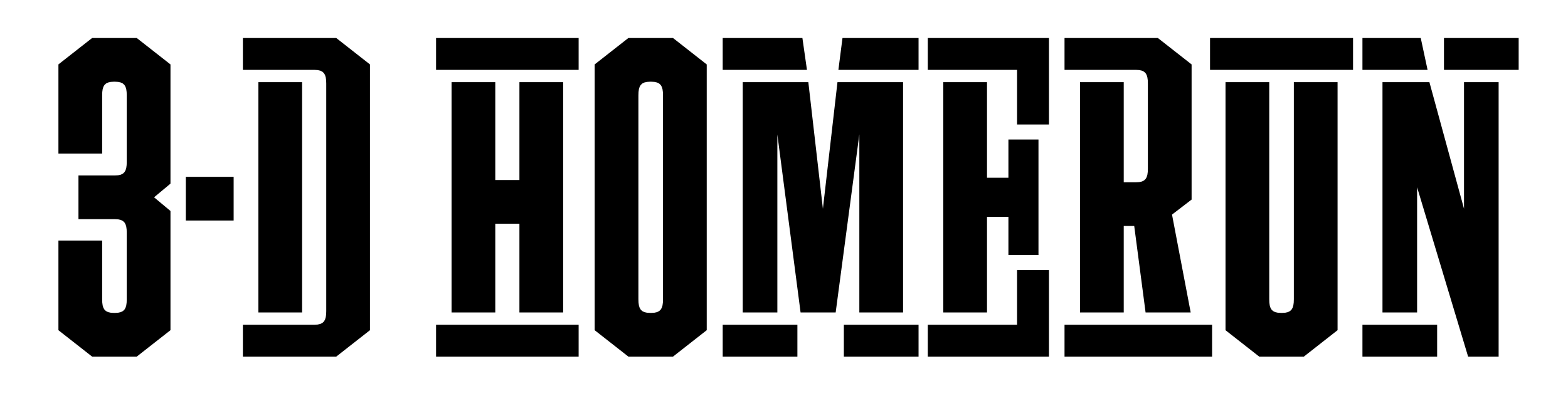
- Mortar. Wild-West style with heavy slabs, a style I tend to call “railroad slab”. The slabs are half-moon shaped. Notable ampersand.
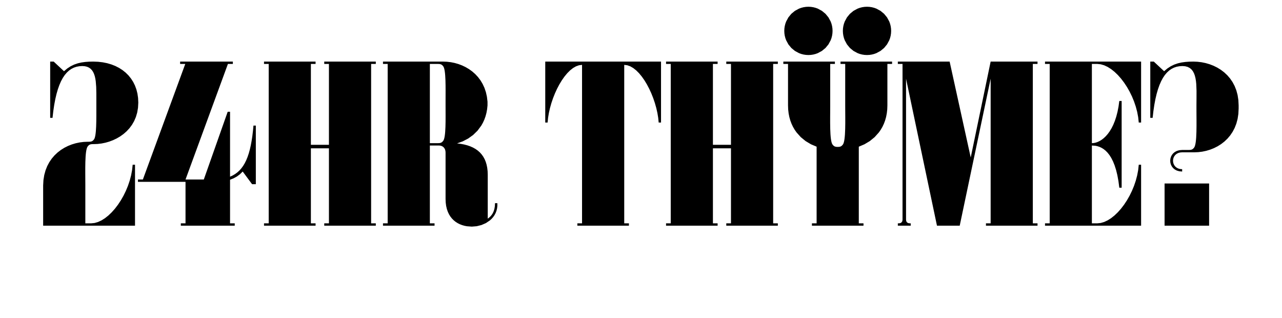
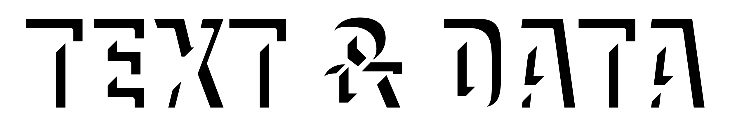
- Plakat. Relatively traditional serif face in the modern style. The details are where it gets weird: tiny horizontal serifs, huge diacritics, strange Y, eccentric 4.
- Cabaret. Narrow rounded sans. Some details are square, which makes for a welcome balance.
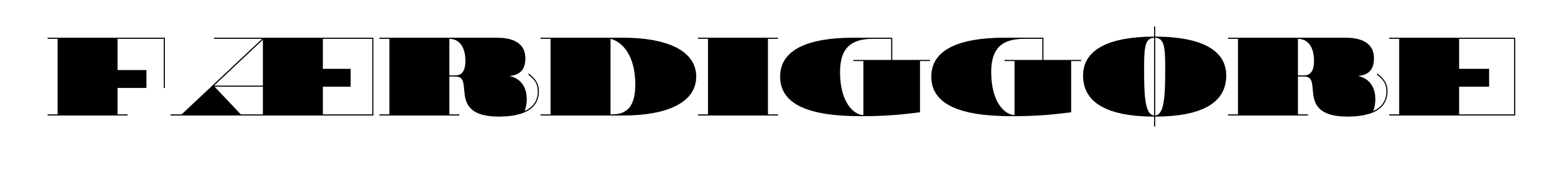
- Antique. Something like a Clarendon. Great R, mutilated Þ. Some letters are missing essential elements, like the A, which lacks a crossbar.
- Lyrics. Every letter is based on a flared rectangle. To me, the serifs have the appearance of hooves, and therefore the whole design recalls a Wild West spirit. I’m not a big fan of the design language, but I can appreciate nice solutions like the letter M.
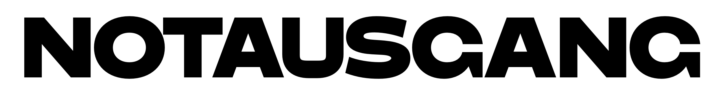
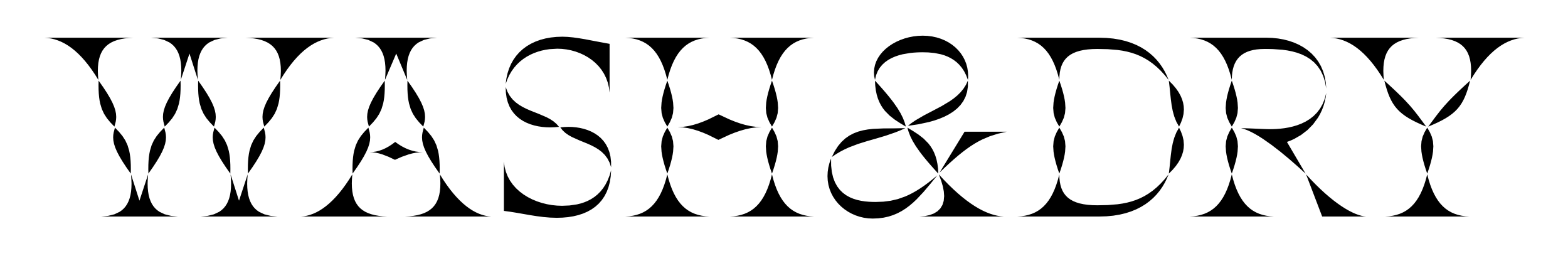
- Protocol. This rounded design evokes typewriters, neon tubes, and bent wire. It is not monospaced. The W is designed in such a way that it would make the Wiener Werkstätte proud. Coincidence? I think not.
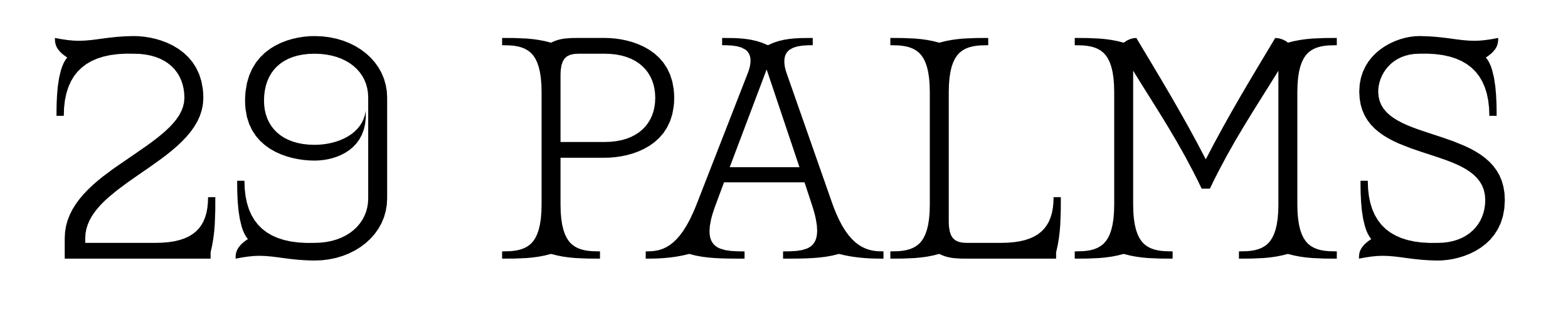
- Routine A. Another design that clearly roots the Pyte foundry in the tradition of wood type. Simplistic, somewhat reminiscent of Poplar, which is a revival of a nineteenth-century face by William Leavenworth. Unlike Poplar, though, Routine A is backslanted.
- Kink A. Similar to Bodoni — but folded in half, if you look at it from an angle. The concept is simple to explain, but hard to digest. Some of the resulting shapes are just…strange? Take some time to think about that X! Contains a handy set for building frames.
- Routine B. The upright version of Routine A (09). Compared to Poplar, the digitization is crisper, the counters more open, and the ampersand is better.
- Kink B. The logical companion to Kink A (10). The Y is delightful. Johannes Lang provided the “kinkify” script.
- Routine C. Like Routine B (11), but italicized.
- Symptom. A narrow design in which the counters flare the same way as the serifs do. In combination with very even spacing (and general avoidance of diagonals), this decision creates an interesting rhythm of positive and negative space.
- Moloch. Flare-flair! Trumpet serifs on straight stems meet rounds bent in the opposite direction, which makes for an almost interlocking feel.
- Galore. This looks like a stencil face, but isn’t. I appreciate the gratuitous stenciling in shapes like the vertical bar or punctuation, and the omission of stencil treatment in other places. This could be used for advertising anything involving coffee beans.
- Residue. Narrow sans with broken curves.
- Perdu. Railroad slab (French Clarendon) taken to the extreme. Very thin verticals. Contrast ratio 1:80. Notable letters: S, X, Þ, &.
- Turmoil. At first glance, a relatively normal, narrow sans serif. But there’s something going on with the counters. It looks like they’ve been twisted, which gives this design a literal twist.
- Polymer. To say this design is decorated would be an understatement. Balls everywhere. The stems are made of balls and teardrop shapes; the serifs terminate in ball terminals. I can imagine someone trying to write this with a flexible nib.
- Houdini. Extremely wide slab, evoking designs like Hellenic Wide. One of the most conventional releases — but that doesn’t mean it’s boring.
- Umbra. Three-dimensional, backslanted. Only the shading is drawn, not the front. One could think this design was outsourced to Milton Glaser, but it was in fact inspired by a 1914 patent for a stencil plate.
- Montage. A delightful design and wood-type classic: screwed letters. Octagonal letters that could be described as a little too simplistic, but make no mistake: the delight is in the details. Is the bottom stem of the Y straight? Are the horizontals really all horizontal? The answer is a resounding no. I appreciate the alternating use of both slotted and Phillips screws. Do it like William Morris: Have no more screws on your letters that you do not know to be useful or believe to be beautiful. (Why is this very practical method of letter attachment not more common in digital type?)
- Flounce. Ruffles. Trifurcated. Perhaps slightly Tuscan? The ampersand carries a little trumpet.
- Throng. Very heavy gaspipe sans, with hairline counters. Squeezes all letters in the same amount of vertical space. First occurrence of lowercase letters (for fitting accents), and alternates (in case those lowercase letters are not wanted). Notable: &, Q, 1.
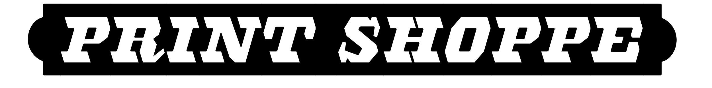
- Italian. Straight-sided railroad slab. Top and bottom horizontals are always thick, and while the uppercase is relatively unspectacular in the middle part of the letter, the lowercase has the horizontals thickened up there, too. Worth looking at: “lowercase” Þ, Z, and of course the ampersand.
- Epitome. I wish Nirvana could have chosen this instead of condensing Bodoni. Also, they should have added a Q to their name.
- Overdose. A take on the Didone genre, with more than just a little weirdness added. The play of thick and thin is fascinating, and the solutions arrived at are genius. Sometimes, the thins are no longer necessary and are therefore omitted. Again, the lowercase slots provide alternates. Contemplate upper- versus “lower”case M. Think about the N. The two different Ws.
- Overdone. Possibly my favorite design of the year. I would say it’s the italic to Overdose (28), although it doesn’t necessarily share all of its characteristics. The contrast ratio is often infinite. The elegance in drawing is astounding; the ball terminals are positively amazing. No particular letters to point out here. All are so great, I find myself just staring at the screen for minutes at a time.
- Gyrator. This is what happens when you twist the stems of an otherwise perfectly fine typeface. The auto-hinter may disagree, but I think this is a successful design. Good for advertising (for instance) a laundry-wringing service.
- Henry I. Dark toothpaste, lightly shaded. The ampersand is nice because it adds another layer of three-dimensionality. The historical source for it comes straight from Caslon.
- Plumb A. A very heavy Clarendon with square counters. Oversized accents give letters a cute look; ball terminals in figures are very chunky and charming. The commas — I like them.
- Blockage. A stencil design, but not really. Based on the concept that each letter consists of two heavy verticals, which is of course not true.
- Seryph. Octagonal, monolinear. Long slabs, almost abstract in places, because serifs close up the counters. Look at W, Æ, K, X.
- Octango. Also Octagonal, faceted. The shading is drawn without an intermediate tone; therefore, the decisions are what make this design fresh. Great: Ø. Stefan says this design is heavily inspired by George Nesbitt’s 1838 design “Octagon”. Downer’s Ironmonger and Hoefler’s Knox are somewhat related, but both lack Octango’s charming ampersand.
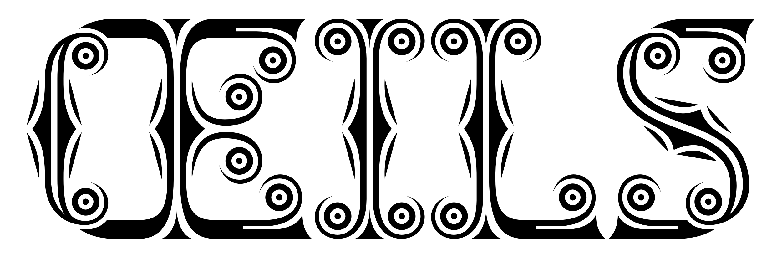
- Potpourri. These letters are basically negative skeletons, held together only by their decoration. Every letter is watching you with at least four eyes.
- Persiflage. Very heavy marshmallow sans. I enjoy the play of rounded versus straight corners. The ampersand is laughably awesome.
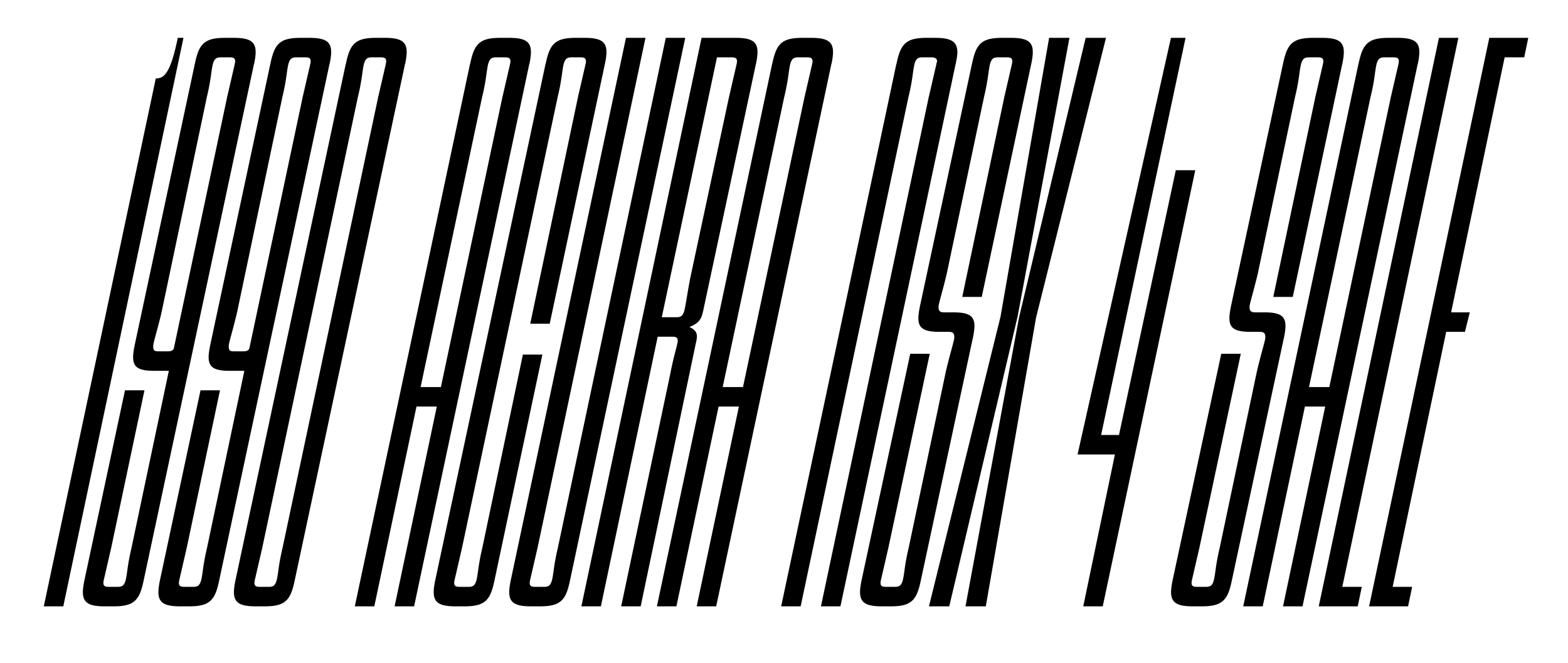
- Radiator Italic. The name says it all. This style is tricky in diagonal letters. N is a cop-out; X is superbly solved. I just wish one could actually purchase an italic radiator.
- Ortho. The name gives it away here, too: orthogonal curves; serifs detach to create another mock-stencil design. The effect is striking. Some letters look like under/overlined sans serif designs (such as H, I, K, M), while others make clear the thick line is not just for decoration.
- Nihilist. A hybrid design. Fat face meets slab, or vice versa. It’s hard to call this combination charming, but still — it’s so much better than Rotis Semi-Serif. This release is joyful, especially in the figures.
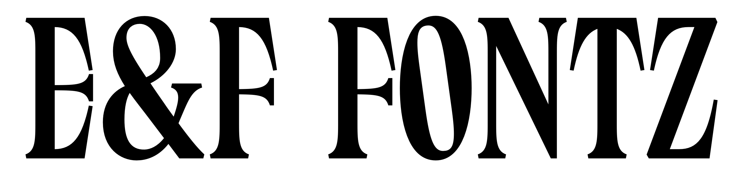
- Errata. A narrow design, hard to describe. Some elements of Caslon can be found, but the proportions are more constrained. The bulging E and F are unprecedented.
- Dosage. One of the few Pyte releases in which “lowercase” letters differ noticeably from their uppercase companions. In this narrow sans, they end up lighter (and even narrower). Look at that ß.
- Vulture. Contrast consequently flipped. That ‘K’ makes me Kringe. The 4 is so horrible it’s awesome. This design satisfies voyeuristic tendencies; it feels like I’m seeing something I shouldn’t be looking at.
- Radiator. The upright version of Radiator Italic (38). It’s hard to make it out at first glance, but many letters actually have alternate designs. AEGJMNPQRWY are available in two options.
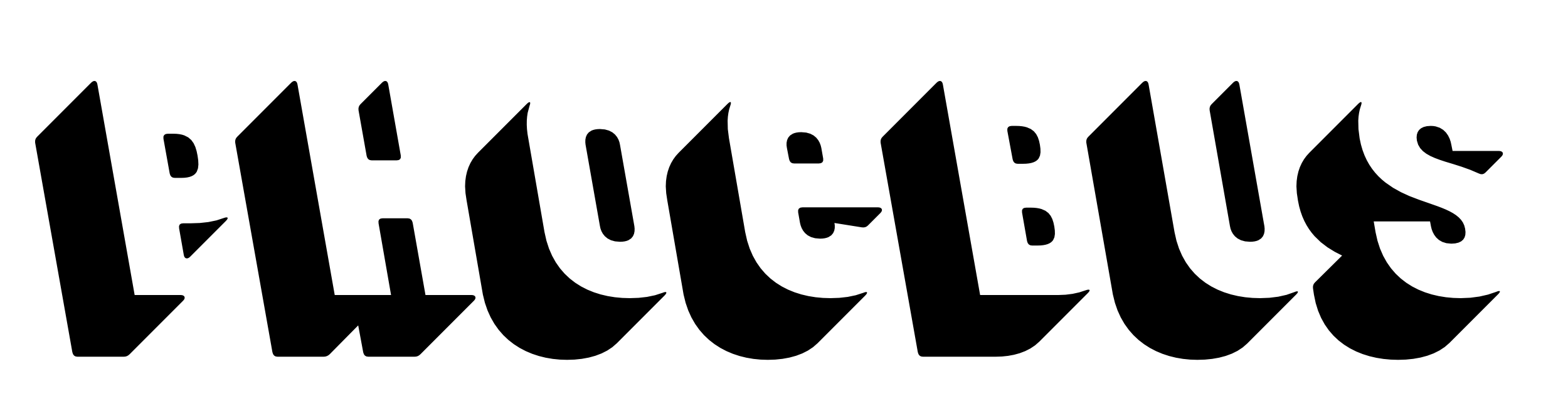
- Filocalus. The hairy serifs and the bright inline remind of engraved typefaces. Absolutely not my style, although I like the 8. The history is impressive though – this design goes back to Furius Dionysius Filocalus (c. 300 AD), the Grandfather of all bifurcated serifs!
- Latency. A three-dimensional design that plays with our habits of perception. Instead of raising the letters off the background, these are embedded into it. The Python script to create the shading effect was (of course) provided by Johannes Lang.
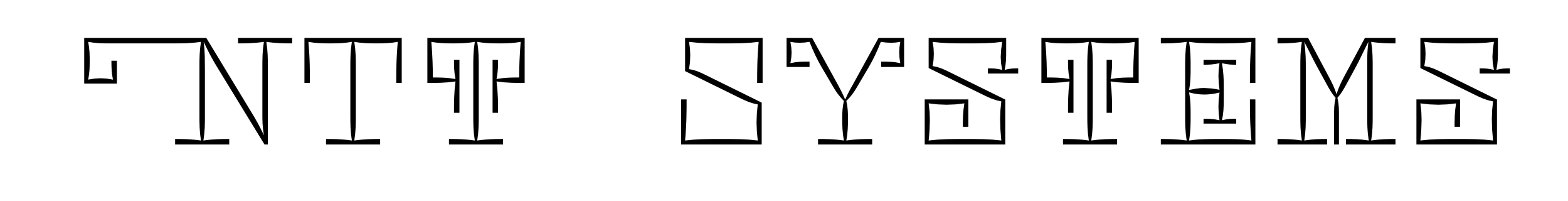
- Postulate. A design that contains no curves — except in the entasis of its stick-like segments. This font has letter variants in the lowercase slots: a swashy N, cymbal-carrying T, and other letters generally crazified (with longer serifs, curlier serifs, and unexpected serifs).
- Syzygy. Brings the idea of Latency (46) to the next level. (As far as I can see, SyzygyShadow = Latency.) Instead of just one font, this release contains ten: Plain, Outline, Shadow, Inner1, Inner2, Inner3, Random1, Random2, Wire1, and Wire2. Most of these can be layered and individually colorized. The Random ones are super-weird, combining glyphs of almost all variants. The ampersand strikes me in every style.
- Henry II, Henry III, and Henry IV. Another layerable typeface, related (obviously) to Henry I (31). The pixelized decoration layer is old-school in at least two ways: 8-bit and cross-stitch. Caslon again!
- Cuneiform and Cuneimorf. It’s common to see Arabic designs look like Latin (or vice versa), but I’ve never seen a crossover with the Cuneiform script. Ellmer has interpreted the influence of the implied tool (a reed stylus) very liberally; his reed can curve in amazing ways (see the ampersand). Cuneimorf has the same characteristics as Cuneiform, but has been left in the kiln for a little too long.
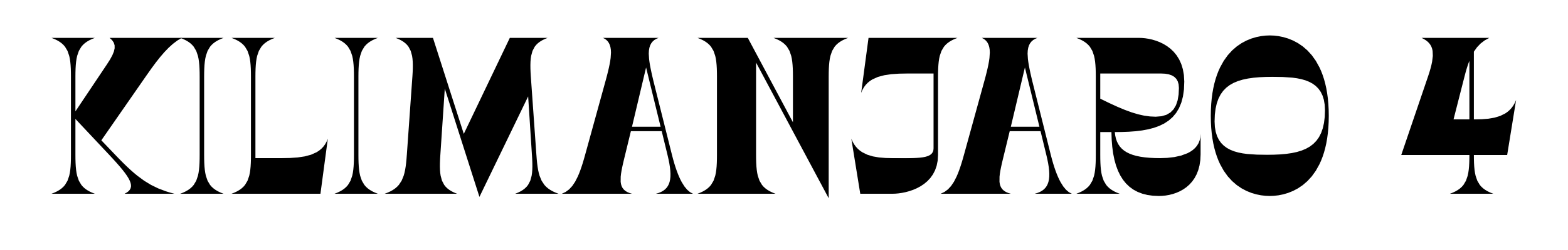
- Absolu 1–4. A multifont release. Extremely heavy fat face design, Ellmerized with some fun details. 1 is a standalone design (and main expression of the idea), 2 and 3 are to meant be layered, the result of which is 4. The ball terminals contain an approximate Fibonacci spiral (because why not); the Ø is slashed vertically (because — again — why not); vertical connecting serifs make many letters just cute caricatures of themselves. I have to say I positively hate that Y.
- QFWFQ Positive and QFWFQ Negative. Another octagonal design with a twist. It’s slanted, and the serifs are also slanted — but in the opposite direction. The negative version contains end pieces (encoded in the parentheses) to make a nice label, to place for instance on a type cabinet. The name? I imagine Ellmer just fell asleep on his keyboard after a long year of Pyte.


Hm. I should consider writing another article: “The ampersands of Pyte”. They’re all great!
Criticism
Beggars can’t be choosers, but this review shall not only be praise. I wish the following glyphs had been included in the Pyte character set:
- parentheses
- asterisks
- quotes (both fake and real)
- some currency symbols
- ❝ ❞ (heavy quotation marks)
I can see why they’re not — they don’t necessarily have the modularity required for the Pyte drawing method. Maybe they can be made available as paid upgrades.
Synopsis
Today, the average font consumer is no longer surprised to see a given foundry release a typeface per week. Pyte may be seen as just another one of them. But there’s no need for comparison with any other foundry. Pyte does not compete. The brilliance of ideas and creativity is unparalleled, and Pytefaces simply cannot be found elsewhere.
I’d like to congratulate the Pyte foundry for a successful 2016, and I hope it can live on — in whatever form. For now, it’s good that the Pyte foundry is taking a break. Consider the health of its sole employee:
The release for week 38 (Radiator Italic) was drawn from scratch in utmost panic (after a lot of “Fuck-that-whole-Pyte-shit” back-and-forth) on Monday evening, finished at 23:05!
If you enjoy the Pyte foundry, or simply have a good sense of design and taste for excellent drawing, consider the (still working) Donate button. A suggested amount would of course be any multiple of fifty-two.
And if you collected all Pyte releases (as I did), or even used them, consider the button even more!
From the Pyte foundry mission statement:
Paying tribute to the typographic diversity of the nineteenth century, this project’s aim is not historical accuracy — none of the typefaces are strict revivals of specific typefaces produced in the Victorian era. It is rather a “revival in spirit” indulging into stylistic manifoldness and idiosyncratic hyperbolism.
Mission accomplished!


Extra point for finding cool names to most of them. My favourites (names) Errata and Overdone.
Hi! I want to test some of the fonts :)
[…] italic, and a bold sans. Despite its modest size, Elmer Stefan presents his first release since the Pyte Foundry’s mammoth project from 2016, with words evoking a world full of cerebral, witty, and contradictory […]