

For a long time Brendan Dawes’ saulbass.net was probably the most popular online destination for devotees of the great designer and film title director, Saul Bass. The website was lost when Dawes did what many of us do: neglected to renew the domain. Fortunately, it’s back again in most of its former glory at saulbass.tv.
One of the few goodies missing in this reincarnation is the free font download called “Hitchcock”. Used by Dawes throughout the site, Hitchcock was created by designer Matt Terich as an homage to the iconic lettering that so often appeared in Bass’ title work. The font is not a faithful digitization of any particular title sequence or poster — in fact, type designer Nick Shinn notes that Bass didn’t do the actual lettering and veteran Robert Trogman adds that Dave Nagata did most of the drawings — but it does give a general sense of Bass’ rough, hand-cut style.
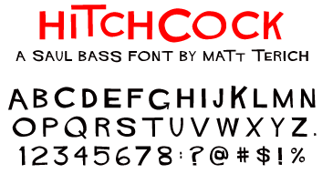
Matt plans to expand Hitchcock’s character set someday. We hope he’ll add alternates to help it better emulate hand lettering. In the meantime, this version will suffice for the hobbyist when used with care and at smaller sizes.
See more of Matt’s poster art and web development at Design Medicine. He and his wife also recently built an art studio in their backyard with two letterpresses and one screen press for their invitation enterprise, Ink Fancy.
Matt has given us permission to host Hitchcock at Typographica:
- Download Mac/Windows OpenType TTF [19KB ZIP]
Please don’t redistribute the font files or post them to any other website. To share the fonts, link to this page (the direct download URLs could change at any moment).
If Hitchcock isn’t quite what you’re after, other fonts in this vein include:
- Kuhlman (David Jonathan Ross)
- Bassanova (Julia Bausenhardt)
- Fido (Patrick Griffin)
- Sabotage (Ricardo Marcin, Erica Jung)
- Keener (Ethan Paul Dunham)
- Taylors (Stuart Sandler)
- Assembler (Ethan Paul Dunham)
- Unstable (Kent Swecker)
- FF Folk (Ben Shahn, Maurizio Osti, Jane Patterson)
- Bensfolk (Ben Shahn, Howard Lohner)
- KutOut (David Phillips)
- Brickhouse (Allen Mercer)
- Birdish & Gorg (Kou Nakamura)
- Square Meal (Stuart Sandler)
- Comrade (Jim Parkinson)
- Nowwhat (Adam Roe)
- Beat Street (Von R. Glitschka and Tony Knight)
The lettering artist that did the lettering for the Saul Bass titles was Art Goodman.
Yes, Robert Trogman reveals as much in the discussion that I linked.
Interesting! I didn’t know that. Maybe the full character set will be called Arty Good Men… if I ever finish (volunteers welcome)
-Matt T.
One of my favourite fonts, but was never sure if I could really use it, because I don’t remember if it is freeware. Is it?
You’re free to use it on commercial projects. You’re just not free to distribute it.
Thank you so much for the Hitchcock font. What a huge gift for my font library. You are so generous! My customer was very impressed, as I used it to dramatize our church ad at Easter (Christ’s resurrection).
Thanks again, and, by the way, I love your site. It is informative and educational.
Thank you so much for this Hitchcock font. Ever since I got it, I can’t stop from trying to use it every chance I get. I was just wondering if someone knew where I could find the Gorg font because the link seems to be dead.
Antonio, you can find Gorg here: http://fontazilla.com/fonts.html
Thank you, James. The link in the post is updated.
Hi! Where can I dowload free hitchcock font on internet? I would like use it in a short film with friends.
Many thanks,
Carolyn.
Carolyn – Scroll up. The link is in the article.
I am also a past employee, 78-79, and knew and had nothing but respect for Art both professionally and personally.
The story I got on the hand was a hand grenade during the big war.
I think the hand and the way he would take a new Pilot Point pen and gab into his desk top to trash the point had a lot to do with the finished product. that and porous paper. Sketch small and blow up on the stat camera.
Yes Saul did sign the posters (multiple versions until the signature was just right for each) but the artwork, lettering and feel for so many of these beautiful posters was pure Art.
I doubt seriously you would have a hard time finding anyone who worked with and for Art Goodman who did not love the man.
thanks for sharing the font with us ^^!
Great font. One of my favorites.
Like its predecessor, Gaumont, GAINSBOROUGH is a font that was designed after the hand-lettered titles of an Alfred Hitchcock film. The Lady Vanishes (1938) was produced by Gaumont-British, and is identified as “A Gainsborough Picture” in the opening credits. Another quirky sans serif.
Thanks for sharing a funky font.
Hey there –
Thanks so much for your beautiful Hitchcock font. I’m using it in the masthead over at my blog, Alfred Hitchcock Geek. If you ever get around to producing a more robust version, please let me know!
Cheers,
Joel
Love the hitchcock font, it’s really come in handy. Thank you! ^^
Art Goodman did not do the lettering for Saul Bass. Rather Saul utilized a number of different lettering artists through out his career. Harold Adler did most of the Hitchcock/Preminger titles, Maury Nemoy did some (St. Joan). I also worked for Bass (in the 80’s) and knew Goodman, as well as Adler and Nemoy. Come see my presentation at TypeCon 2010 in LA.
They were all nice guys, in my book. I loved it that Bass still went to AIGA meetings when he was old and walking with a cane.
I have been searching for so long a font similar to this one as I’m a fan of hitchcock since I was 12! Thanks a lot for sharing!
Note that in 1997 Chank Diesel created a font also named Hitchcock based on the same Saul Bass/Art Goodman lettering.
when i downloaded hitchcock it’s not the same as in the image above. why?
in what year was the font designed?
That’s strange, Nadine. How is it different?
Thanks for sharing dude, some pretty sweet fonts here. Also appreciated the comment left by Michael. It set the theme somewhat.
Hi guys, I’ve just finished adding diacritics to Hitchcock font for my client. I’ll talk to him, maybe we can share it. For now Hitchcock Extended supports all Latin-based languages, or at least I hope so. It’ll be great to hear something from Matt Terich about this too.
Hi Ilya. I’ll alert Matt to your comment. If he gives permission I’d be happy to host your expansion here.
Looks good to me, Stephen.
I used this font on OSX 10.8, but now on Mavericks (10.9) it won’t install. Any ideas? Love the font!
Beautiful typeface. Art Goodman was a fantastic, beyond-belief talent, a humble associate of Saul’s, and a complicated man. Saul Bass was a genius and a complicated man. I am so happy (more!) to have known and worked with them both.
This font doesn’t work in photoshop.
It should, Colton. What is broken? What OS and version of Photoshop are you using?
Photoshop CS5 on OS X El Capitan (10.11.3). I tried installing a regular .ttf font, and it showed up, but installed this and it only shows in Pages, not Microsoft Word or Photoshop. I tried varying methods of disabling and enabling font in Font Book, then also dragging the contents of the folder into library itself. I also tried installing the Windows version for fun. Restarted Photoshop and Word too. Any suggestions? (Font validated just fine.)
Wish I had a good answer. All I know is that the Mac PostScript works for me in Photoshop on the same version of OS X. Try clearing your system and Adobe font caches?
Is there a way to license this font for non-personal use? I would like to use it in a card game and want to make sure I take all the correct steps.
Josh, contact the designer, Matt Terich. His studio is linked in the article.
I love seeing the revival of Saul Bass’s work and the Hitchcock font! It’s amazing how these timeless designs continue to inspire and influence modern aesthetics. Excited to see how they’ll be incorporated in contemporary projects!