
Last year, after 14 years of work, Carl Crossgrove finally released his magnum opus. A time well-spent, that’s for sure. Beorcana has what it takes to become a classic.
The typeface has no serifs, yet it’s the opposite of a grotesque. It exhibits the rhythmic contrast and the humanist proportions of a renaissance roman.
Its letters please with vividly dancing forms in every detail. However, this obvious calligraphic derivation never seems inappropriately fancy — even the spruce swash italics are down-to-earth in a convenient way. The Thin isn’t anemic and the Ultra isn’t heavy-handed – Crossgrove really knows his stuff. Beorcana looks refreshing – and at the same time so self-evident and familiar as it had always been around.
While these days Zapf’s Optima (the somewhat moldy godfather of this genre) can be seen almost merely in drugstores and on cosmetics packaging, Beorcana’s field of application is a lot wider, featuring seven weights for display sizes, five for text use, and another two for tiny captioning (each of them accompanied by their corresponding italics). The Beorcana clan provides a versatile system, and particularly meets the demands of a book workhorse.
Those who claim that longer reading text can’t do without serifs haven’t discovered Beorcana yet. I’m looking forward to seeing a lot of it, both as a designer and a reader, and can hardly imagine an overuse. Beorcana is here to stay!
“While these days Zapf’s Optima (the somewhat moldy godfather of this genre) can be seen almost merely in drugstores and on cosmetics packaging…”
The above characterization of Optima is unfair, unflattering, and uninformed.
1. Hermann regards Optima as his favorite “daughter.” (This indicates not only a gender, but a relative age.)
2. Moldy? If anything, Optima has remained the embodiment of cleanliness and sterility. Cosmetics ads and packaging are not known for moldiness. Quite the opposite.
3. Beorcana follows a lineage not exclusively associated with Zapf/Optima, per se, but with 20th-century letterers who “got” what Rudolf Koch was teaching. Berthold Wolpe (Albertus), and Warren Chappell (Lydian, Trajanus) were both pupils of Koch. Bob Middleton’s typeface, Stellar, is yet another example of a design that pays homage to the leanings of Koch. Beorcana shows that Carl has been tuned in to sources which have not been mentioned, and perhaps not even understood, by Florian Hardwig.
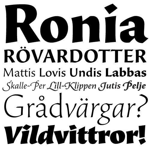
That should be Ronja, not Ronia! This looks awsome Carl!
Dear Mr Downer,
It has been some time, still, I would like to address your criticism. I didn’t intend to offend Mr Zapf, nor to diss his daughter. You apparently felt I did so, and I’d like to apologize. It’s very nice of you to stick up for him here, although I don’t think that Mr Zapf’s œuvre needs defending, certainly not against me.
You are right, that characterization of Optima was worded inappropriately. While “angestaubt” may be translated as “moldy”, “worn” would have been the better option for what I wanted to express. You say “Optima has remained the embodiment of cleanliness and sterility”. And I think that is exactly where the problem lies, for me.
I am not referring to Optima as a typeface, per se. There’s nothing wrong with its curves. Quite the contrary, it’s a beautiful design, well-established for decades. I didn’t call it the godfather of its genre for nothing.
Rather, I am referring to Optima’s perception. Optima is in the ring for more than 50 years – always going strong, through changing techniques. This exposure has left its mark. A typeface isn’t formed by its outlines only. All the usages – some of them excellent, some mediocre, and a lot of them not so good – add to the image.
While I absolutely can enjoy Optima’s classiness in an adequate application, I also learned to distrust it, after too many people have utilized it in order to easily achieve a somehow ‘dignified’ look. In 2009, Optima has the questionable charm of a bundled system font.
The last thing I wanted to imply is that Beorcana was the new Optima, or a better Optima. Actually, I don’t think those two typefaces have a lot in common, besides belonging to the same small genre of the serifless roman.
I’m especially sorry that this imprudent side note might have hindered further discussion about Beorcana. Learned my lesson: never mention another typeface in a review. I am really curious to hear what you think of Beorcana.
Frode, in the English version, Ronja Rövardotter is called Ronia the Robber’s Daughter (and, of course, Ronia doesn’t have that nasty descender!).
I’ve never liked Optima. The “nicest” thing I’ve said about it can be found in my penultimate post here: http://typophile.com/node/54094
In contrast, Beorcana is alive and sincere.
What a beauty, especially the micro version.