
 Typographica’s fourth annual review showcases the best in new typeface design. Twenty-five of the world’s brightest graphic and type designers selected their favorite font releases of the year. We welcome to our regular cast of contributors: David Berlow, Ellen Lupton, and Erik Spiekermann, among others.
This edition brings two changes. First, the description has evolved from “fonts” to “typefaces”. Yes, there is a difference. Mark Simonson explains it best:
“The physical embodiment of a collection of letters (whether it’s a case of metal pieces or a computer file) is a font. When referring to the design of the collection (the way it looks) you call it a typeface.”
Our feature is more accurately a celebration of new typefaces than new fonts. Keeping these two terms distinct may be a losing battle at a time when some have already declared the words interchangeable, but we’re going to go down fighting.
Also new this year is an expanded format. Each selection gets a larger sample image, its own comment thread, and (where available) examples of the typeface in real-world use. I hope the new format encourages discussion about each face and stimulates the typographic side of your design brain.
Finally, a word on who to watch for in 2008. I was tickled when our list was once declared “the Oscars of type design”. That label is too grand — but what the heck, let’s run with it. A few rare actors and directors are nominated for two Academy Awards in a single show. It’s just as remarkable when a type designer is honored for more than one typeface from the same year. Our latest crop of honorees has three such standouts: Tomáš Brousil, Christian Schwartz, and Kris Sowersby. Schwartz makes a perennial appearance on the list — no surprise there. But Brousil and Sowersby are newcomers, each showing incredible talent, range, and an ability to meet the needs of the modern graphic designer.
Without further ado, the envelopes please.
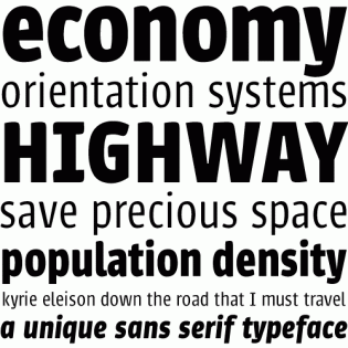
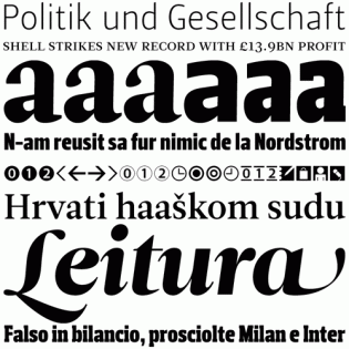
The 2007 selections are shown in the column at right.
Other notable releases from the year are listed below, with the editor’s favorites at the top of each class.


Brilliant, as usual. If Typographica did nothing but this yearly round-up I’d still be happy.
Personal favs, Greta and FF Meta Serif.
Another great list. Thanks for all your hard work. A truly inspirational list of typefaces (some nice fonts too ;) )
Finally. ;) Nice.
Thanks, as well. My personal favs out of the winning ones: Graphik, Malaga, Minuscule and Los Niches.
Thanks for highlighting a font of Uruguay (Economica).
Nice List. Thank you. You got my del.icio.us bookmark!
My favorite is Graphik by Christian Schwartz for web.
BTW, if everyone could digg this story here:
http://digg.com/arts_culture/top_fonts_of_2007
that would bring us plenty of extra-type-insider traffic.
Wow! A wonderful bunch of new fresh typefaces. well done everyone. Also thanks guys for mentioning Brasserie.
Cheers
2007 was a good year for typography. Beautiful list.
A good crop this year! Thanks for pulling this together.
ChrisL
Thank you for trying to restore the distinction between typeface and font.
Boy, it sucks to be a web designer! Such beautiful work.
Chapeau ! and Merci !
Jacques
The way I relate the difference between typeface and font to my students is by comparing them to songs and MP3s, respectively (or songs and CDs, if you prefer a physical metaphor).
As an interesting side note, music also has some awkward terminology jumbles very similar to the font/typeface thing: Most people (including myself) use album and record interchangeably, but I’ve heard discriminating music nerds scoff when someone refers to an album reproduced in CD form as a record (which, they argue, is a term reserved only for the grooved vinyl discs which are played with a turntable and stylus).
I tip my hat to your selection and shared it with the typesetting community on typesetterforum.com
Would be nice to have the best public domain or GPL’d typefaces of 2007. As you know the quality of the free stuff can be hit & miss. Sometimes per glyph. ;P
That would be a very short list indeed, Thomas.
Great work! Thanks for putting the super trouper on Pilo.
Hi Stephen.
Thanks for visiting my blog. And thank for the explanation of typeface vs. font. You said ‘clear as mud’, but your ‘song vs. MP3’ explanation was crystal clear. Makes sense to me now. Cheers, eh!
Nice collection. Thank you for this. It’s always hard straying away from one’s favourites and finding new ideas. Cheers.
You forgot Champion Script Pro.
Ahhh. I look forward to this list every year.
Great, tasty, lucid and luscious. Thanks and thanks again to all who helped pull this list together.
Thanks too for mentioning Amity and Sibyl. Being in such illustrious company is rocket fuel to me.
To infinity and beyond!
2007 was a good year for typography.
It sure was man.
beautiful.
Alida has such an attitude, snap girl!
I used her in a logo design for a local food chain. We had each letter printed on a 42″x35″ canvas from and put in their regional offices, they loved it and the white font just went pop on the colored background.