
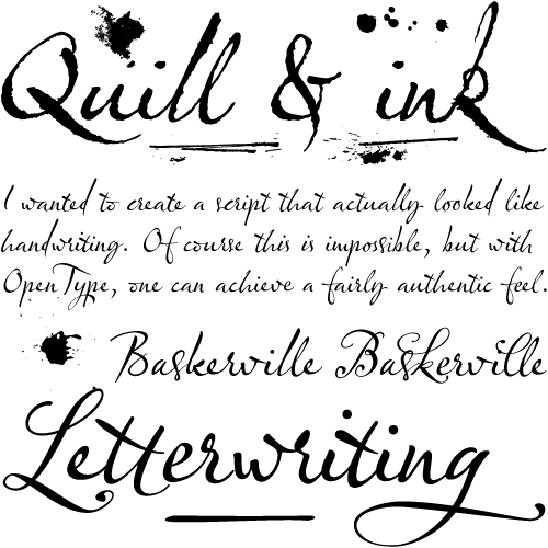
When Olicana appeared on the Typophile critique board there was an atypical outpouring of enthusiasm. Why? Maybe it was the way the font convincingly suggests the texture and flow of ink. It might have been the underlying discipline of the hand which keeps Olicana surprisingly approachable and endows it with a lovely clarity. Certainly all of these aspects must have contributed.
But I think the primary reason it was so powerfully and instantly popular was the font’s voice, a personality both complicated and unique. On the one hand it has a casual and authentic sense of vivacity and fun. On the other hand this expressiveness is intermittent; it continuously but gently teases the eye. These features are especially appealing in the context of an otherwise confident and disciplined hand.
Of course, the by now obligatory contextual features such as ligatures and end characters are present. And in addition Olicana comes with several kinds of treats. Impressively it has a rough and a smooth version which suggest the effect generated by writing on different paper stocks. It also has optional swashes which somehow increase both the sense the formality and the whimsy conveyed. And it offers ink blots and scratches which may be applied over the font to add inky verisimilitude.
What a wonderful script. Would have chosen it for myself, too.
I like the concept of integrating “mistakes” into the font to give it a more irregular look. The numerous alternates, the lively look: simply marvellous
A scriptfont which I would like to have as my own handwriting. Mistakes included.
And as I followed the thread on the Typophiles-Typecritique-thread I felt like I followed the birth of a new handwriting-standard. Congratulations, Mr. Cooke.
Really beautiful.
This really is a beautifully constructed script.
The ligatures and contextual alternatives really enhance the set.
The swash set injected at a minimum, near completes it.
The only drawbacks that I can comment about are:
1. The height (and angle?) of the cross stroke on the standard ‘t’ seem a bit too high when examining the ‘overall look’ of the sample text. In some instances it does look good; but in other instances, not so good. The ‘tt’ with ligatures (etc) on looks superb.
2. The height of the ascender on the standard ‘d’ seems a little too tall for my liking. A shorter and broader countered ‘d’ could be added to further enhance the set.
3. I would lighten the leg of the alternate ‘k’ in the standard set.
That aside, I would be happy to purchase a set when I get a chance.
Well done Nick Cooke.
Ack! I can’t believe G-Type & Veer still haven’t gotten their stuff together. Both the rough and smooth will sell like hotcakes. Nick, I’d love to see this on MyFonts, too!
I might as well chime in with FontShop’s interest. But Nick already knows about that. I’ve been courtin’ him for years.
A damned fine piece of work and no mistake. Nick has plenty more gems up his sleeve and has just released the wonderful Houschka Rounded family, available from Fontworks and type.co.uk
I’m working on an update at the moment. An unsatisfied customer from the Czech Republic emailed to say the accented caps don’t work properly – they wouldn’t, I had forgotten to insert them! Too much to think about when producing this, my first OpenType typeface.
I’m also making more ligated characters which I have noticed are needed through usage, making ordinals, Caps to Small Caps feature, and will take into consideration your comments David.
I’m giving serious consideration to making a ‘Fine’ style with much thinner thin strokes to emulate a lighter hand.
Thanks everyone for your comments.
I am not optimistic about Veer marketing G-Type again; since their acquisition by Corbis they have developed a very intransigent attitude, with some totally unacceptable clauses in their contract. Shame really, as we did good business together in previous times.
How can purchase OLICANA.
I am in love with the font.
Thanks
Daniel
Daniel – please see the purchase link to MyFonts above.
Lovely font! Great, simply great!
G-Type is available again on Veer.
http://www.veer.com/products/vendor.aspx?vendor=gtt
Great to have Nick on board again. The new OT version of Houschka is amazing. The progression of weights is perfect now.
Indeed. G-Type (including Olicana) is now available at FontShop.
I personally love this font. Versatile.
Olicana and all other G-Type fonts available directly from the designer Nick Cooke at http://www.g-type.com, currently at 25% off.