Irrlicht comes to haunt us like a mad ghost in the night.
First credit goes to the naming: Irrlicht is a beautiful German word at the edge of extinction. It’s not used much these days, sadly; it even has a verb — irrlichtern means something like wandering or running around or, as I just discovered, “to flit about” (in a state of shock or disarray). It contains irre, which means lunatic, crazy, mad, funky, freaky, insane — comprising all sorts of moods outside the so-called “normal”.
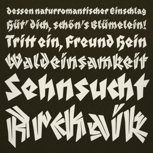
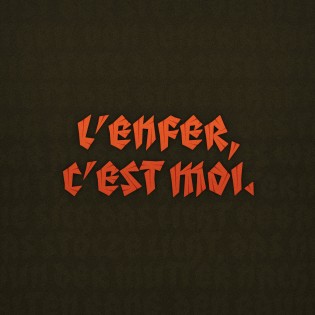
Irrlicht is deeply rooted in German Expressionism. The rough and somewhat brutal shapes of the letters recall a basic craftsmanship. They feel like carving and woodcutting, make us think of shaping things in a hell-bent manner, an outburst of creative energy driven by mere necessity. No wonder: Expressionism was the dominant style in German art and literature after World War I; it reflects the postwar atmosphere of alienation, disillusionment, and danger. Artists reacted against materialism, mechanization, urbanization. Their spontaneous and highly emotional ways of working and living were followed by several art movements in the 20th century, like Abstract Expressionism, for instance, or Neo-Expressionism.
(Thus, “hinkypunk” is a translation of Irrlicht that seems too nice and fun — I’d rather go with “friar’s lantern” or “ghost light”, or maybe “jack-o’-lantern”.)
Some facts: Irrlicht is based on C.H. Kleukens’ typeface Judith from 1923 and comes as Dunkle Irrlicht (dunkle means “dark” in German), extended by the bright Lichte Irrlicht. The Lichte style was first planned as a stand-alone stencil version, but the styles work perfectly together. Irrlicht comes with upper- and lowercase ligatures, contextual and stylistic alternates, fractions, superior and inferior figures, extended language support and a few extras.
Alas, Irrlicht does not call for facts. It calls for fiction. Think of the book covers and movie posters it would ideally adorn. Think of Expressionist-experimental novels; go see paintings by Ernst Ludwig Kirchner and other Die Brücke members (Erich Heckel, Otto Müller et al.), recall The Cabinet of Dr. Caligari (filmed by Robert Weiner in 1920), Nosferatu (F.W. Murnau, 1922), Fritz Lang’s Metropolis (1927), and find out more about the Weimar Cinema; indulge in those old-school horror films, slow movements of dark gestalts with pale faces followed by their gigantic shadows flickering on some huge wall behind them, in threatening, unfathomable urban surroundings …


Fine article, thank you, Sonja! Well explained. Would you have an idea where I could find Fritz Lang’s (?) less expressionistic, more flowing typography seen in here?
Thanks for your response, Fritz! Sorry I can’t really help (anyone?), but I found these guys, discussing Fritz-Lang-related fonts: fonts:http://www.typografie.info/3/topic/25930-schriftart-aus-die-nibelungen-fritz-lang/. And of course you could ask @Font_ID / fontid.co (hello, Stephen)!
Unfortunately, Sonja, “Samjonowitsch” seems only to be looking for Fritz Lang’s elaborate initials. I’ll try fontid.co! Grüße, Fritz