- 05.13.13
Library Subscriptions: The Future of Fonts? Shall We Sing or Cry?
Rudy: I think that you forgot one major question: Why would a type designer continue to develop type? Their part of the cake become… - 05.04.13
Roof Kerning in Amsterdam
Matijs van Zuijlen: So, does the current actual placement of the letters match the one in the artist's impression?… - 05.02.13
Instant
Hrant: Instant confuses me… The part of me that loves innovation gets happy looking at it, but the part of me that insists on sober … - 04.26.13
Krul
Tim: I love that a face so decorative is this legible. A very nice achievement.… - 04.16.13
Source Sans
Hrant: There's something I'd like to clear up, although it might essentially be merely a terminological issue: assuming it's true th… - 04.14.13
Roboto is a Four-headed Frankenfont
Christoph: Amazing! Thanks, Stephen. And the fun just never ends.… - 04.09.13
Comenia
Andrew Boardman: A beautiful and extremely usable "superfamily" that I hadn't considered previously. Thanks, Florian, as always.… - 04.09.13
Balkan Sans
Thomas Dang: Interesting concept but it's difficult to read and the kerning leaves something to be desired. I'm certain that it would not … - 04.07.13
The Elements of Typographic Style, Version 4.0
Craig Eliason: Thanks for this well considered and written review. For me, I never considered Bringhurst's book a bible. Among other quirks,… - 03.31.13
JAF Bernini Sans
Hrant: Thanks to Bill Dawson's piece on XK9 I just realized that Bernini is actually a brother-sister twin, with one being more rese… - 03.20.13
Our Favorite Typefaces of 2012
Stephen Coles: Nick Sherman raises good questions about quantity. I think it’s useful to have a discussion about what this list means and wh… - 03.19.13
Turnip
Hrant: I love Turnip, for the magical transformation it performs between display and text, and the wonder it injects into the craft … - 03.18.13
Quintet
Stephen Coles: It’s been over a year since I saw Quintet on the KABK class of 2011 site and I am still amazed by it. It was a monumental ach… - 03.18.13
Colvert
Hrant: I could opine that the Greek is particularly nice, but most of all I think the collective level of sensitive competence in Co… - 03.18.13
Garvis
Hrant: It was great to watch this design grow up, go to college, and get a job! James is a proud dad for sure.…
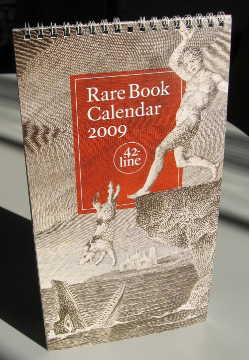
The most striking printed gift I received this holiday season — being Jewish I get gifts a bit earlier than most of you — is the 2009 Rare Book Calendar from 42-line, a Bay Area firm that specializes in “digital publication services” for rare book dealers, libraries and book collectors. This means that 42-line deals with imaging, editing and other services related to the organization and archiving of books, manuscripts, photography, and other types of rare-materials collections.
The Calendar is small and of a non-standard shape — 11 inches tall by 6 inches wide — and would fit fine on a small bulletin board or hanging in even the tightest workspace. The structure, too, is somewhat unorthodox, or at least new to me: six pages have January through June on the front, at which time the calendar is flipped over, and July through December, printed on the rear, are then presented.
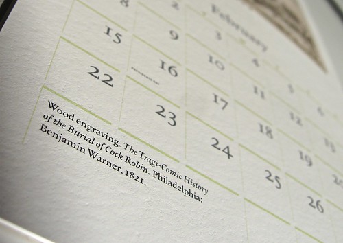
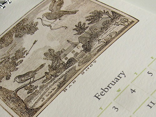
While the format is interesting and the typesetting is exceptionally clear (the principal type is Mark van Bronkhorst‘s subtly beautiful MVB Verdigris, one of my favorite text faces of the last several years, and the calendar itself was designed by the type designer), the calendar is really about its illustrations: each month is accompanied by a printed reproduction from an important piece of bibliographic history. January’s Giovanni Battista Ferrari copperplate engraving of an amaryllis is a beautiful example of 17th-century lettering and illustration, and some of them are very funny — Benjamin Warner’s 1821 Tragi-Comic History of the Burial of Cock Robin, for example, and an engraving of a dog taking a very unfortunate swim by the always-surreal William Blake.
I feel like I must have done something to warrant such a nice gift, but I can’t quite remember what it was. It’s available for a mere $10 and is a good introduction to an interesting company.
More images of the 2009 Rare Book Calendar »


Thanks for letting us know about this gorgeous calendar, Joshua. Just ordered mine and can’t wait to receive it!
Beautiful–thank you for this tip!
Very desirable, if you — like me — spend too much time at Bibliodyssey
Fantastic link, Fredrik. Thank you!
Really beautiful! Shall have to look at getting one.
Great gift, I would feel really glad to get that too! Congratulations. Hope you use it as much as can in this new year that has arrived with lost of prospect promises. Cheers from New Zealand!