
Science fiction is a mirror. It’s rarely good at predicting the future, but it’s great at telling us what we’d like the future to be, or what we fear it may become. Isaac Asimov, Arthur Clarke, Robert Heinlein, Philip K. Dick: familiar names that guided many imaginations to think about societies spanning the galaxy. Then Star Wars finished off what 2001 started: rich visual textures and soundscapes made it ever more difficult for our imaginations to keep up.
But there were two things that always bothered me about science fiction. First, everybody speaks the same language, or understands the other person’s locutions without so much as an “excuse me, can you repeat this?” And, most frustratingly, nobody ever reads. Nobody. Sometimes there are symbols, diagrams, and gibberish that brands a vehicle or a building, but that’s pretty much it. It is as if some mundane version of mind-meld has rendered obsolete those moments between you and some letters on a surface in front of your eyes.
Well, it didn’t turn out that way. We know that people read more than they ever did. Perhaps they read fewer of some traditional thing or other (and even that depends on the region) but, overall, more people spend more time looking at strings of letters. What was once a dedicated activity has expanded to fill out the previously empty spots of the day: news, a story we saved for later, the playground utterances of Twitter, the trivial ego massages of Facebook. It pains to imagine Dick’s Deckard checking his smartphone while slurping at the noodle bar, but you can bet that this is exactly what he’d be doing today. And we have only begun to see what ubiquitous tablets will do. Many years from now, these very few years at the beginning of the century’s second decade will be seen as a key inflection point: The combination of portable, personal, ever-present, ever-connected screens will transform our ideas of learning, of exchange, of creating new knowledge to degrees unimaginable by our idolized authors.
There is one problem, however: the future is turning out to be more complicated than we had imagined. Instead of a single, Esperanto-like über-language, most of us are growing up with two parallel identities. One is based on a commonly-owned, flexible, and forgiving version of English, with a rubber-band syntax and a constant stream of new words that spread like an epidemic to other tongues. The other is our regional and historical identity: local in geography, and deeply personal in its associations. This identity is awash with the memories that make us who we are. It comes in the language we dream in, the language of our laughter, our exasperations, and our tears. Overwhelmingly, this language is not English, and quite likely it is not in the letters of the Latin script.
Indeed, just as globalization brought a wave of uniformity, it also underlined the rights of communities to express themselves in their local languages and dialects, in the script of their traditions. But the growing urban populations (over half of everybody, now) are contributing to a demand of complex script support. The equivalent of a single typeface rendering a plain-vanilla version of a language is not a new thing. For about two decades we’ve had the equivalent of a global typewriter, spitting out a single-weight, single-style typescript for nearly every language, with varying degrees of sensitivity to the historical forms of the script. Great if you only speak in one tone, only typeset texts with minimal hierarchies, and don’t care much about the impact of typography on reading. Indeed, the typewriter analogy is supremely fitting: the limitations of typewriter-like devices migrated onto subsequent technologies with astonishing persistence, despite the exponential increase in the capabilities of our typesetting environments.
Stage One: getting fundamentals right
So, here’s the context: globalized technologies and trends, with localized identities and needs. But typeface design is nothing if not a good reactor to changing conditions. Indeed we can detect a clear path for typeface design in the last decade, with two-and-a-half distinct stages of development.
The first stage was about rethinking how we develop basic script support for global scripts. Starting with pan-European regions (wider Latin, Cyrillic, and Greek) and gradually extending outwards to Hebrew, Arabic, and mainstream Indian scripts, typeface designers moved away from re-encoding the dated, limited typefaces of the previous technologies. This development led to two narratives that are increasingly central to typeface design. On one hand, an understanding of typemaking and typesetting technologies, and their critical impact on character sets, the design of typeforms, and the possibilities for complex behaviors along a line of text. On the other hand, an appreciation of the written forms: the relationship of the tools and the materials used for writing that determined the key formal features of each script.
For many designers the depth of research required to tackle a new script was a surprise, and not always a welcome one; but increasingly the dimensions of the challenge were respected, and understood. This research began, very slowly, to liberate global scripts from the formal tyranny of the Latin script and the expediency of copy/paste. Notions of a uniform stress at a steep angle, and of serifs to terminate strokes, are gradually seen to be primarily Latin-specific. And the faux-geometric, over-symmetrical, pot-bellied International Style typefaces are steadily unmasked as an intensely North-Western style, meaningful only as a response to the post-war trauma and urban explosion of the 1950s and 60s. Already dated by 1985, their continued adoption serves only to discredit their users and promoters. When taken as a model for non-Latin scripts, they are increasingly recognized as the typographic equivalent of a cultural straightjacket, limiting innovation and the expression of a more sensitive and current identity.
This does not mean that new typefaces with non-Latin character sets were all good, let alone perfect for their purpose. But people started questioning their assumptions, and put their money where their mouth was. Most notably, Microsoft (with a global perspective early on) and Adobe (starting with Europe, and gradually expanding its horizon) asked themselves, and others who could help, how to get things right. Their typefaces with large character sets raised the bar for many subsequent designers, and in many ways continue to determine the default level of script support on a global scale. (Regrettably, Apple never claimed a seat at this table: throughout its ecosystem its use of typefaces remains persistently unimaginative and pedestrian, abandoning any aspirations of typographic leadership.)
Stage Two: linear families
The second stage in global typeface design came when development migrated from the big developers to the publishers catering to the publishing and branding markets. The briefs for typefaces mutated from very broad specifications (for fonts that ship with operating systems and office suites, or bundled with page layout applications) to the needs of very specific documents, with rich hierarchies and multiple styles. While Office could muddle through with four Latin styles and one each for most non-Latin scripts, a newspaper or a magazine demands a range of weights and widths — especially if the templates are imported or designed to match an existing house style. Headings and subheadings, straplines and pull-quotes, footnotes and captions, for starters. And, hot on the tails of global publications and multi-script branding, come the limitations of doing the same on smaller screens, where the color palette and the typefaces may be the only elements that transfer fluidly with some consistency across materials and devices, bridging scales from the pocket to the poster.
In the previous stage designers had to ask themselves what are the fundamental differences, for example, between Arabic-script typefaces for Arabic and Persian and Urdu texts. Now the matter shifts to something like, “What are the typographic conventions in these language communities, what are their traditions, and what are the rules for differentiating between contrasting kinds of text within the same document?” In real terms, this moved design from the single typeface to the family: how will a bold Devanagari relate to a text weight, and how far can you go in adding weight? Can you squeeze, condense, or compress? And how light can you make the strokes?

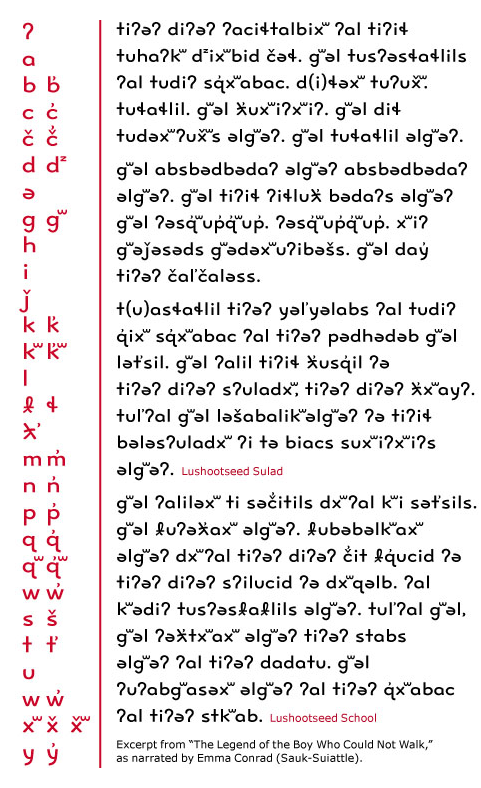
Juliet Shen’s typeface for Lushootseed, the language of the Tulalip Native American tribe.
The answers to these questions stem from a deeper engagement with the script, and an understanding of which elements are integral to maintaining the meaning of the glyph, and which are there to impart a style and build the identity of the typeface. All typeface designers (native or not) need to understand the impact of type-making and typesetting developments on the script, engage intensively with the written forms, and consider the development of typographic norms within a community. But we know, through the evidence of many successful typefaces, that designers need not be native to a script to design well for it; in many cases, they might not even be able to read the text they are typesetting. This may seem counterintuitive. However, good typefaces rely hugely on the designers’ dialogue with convention, and their understanding of very clear — if not always obvious — rules.
Having said all that, this stage of typeface development for global scripts is inherently conservative. The recognition of the formal richness of non-Latin scripts, and the efforts to design new typefaces that respect this complexity and represent it adequately, is a corrective against past sins, technological and human. Typefaces that are well-designed and comfortably read by native communities, while allowing multi-script typesetting for a range of different applications, are a Good Thing, but nothing to be particularly proud of. This is the typographic infrastructure of a connected world. These typefaces are elementary, and essential. They have to be many, because the documents they are used in are hugely variant in their specifications and complexities; and when contemplating multi-script typesetting, the specifics of the document determine which typefaces will do the job better.
But for all the celebration, these new, expansive families are refinements of fundamental forms, without raising difficult questions. It is a relatively simple process to add weights to a typographic script, hindered only by the scale of the work, when the character set is substantial. The challenge becomes interesting only in the extremes of the family, the very dark styles, and the very light ones. At these extremes designers need to deal with loops and counters, stroke joints and cross-overs, and all sorts of terminals that may not accommodate a dense stroke within the available space, or dilute the distinctive features of the typeform. Indeed, these extremes demonstrate clearly how the neatly expandable grammar of the Latin script, with its misleadingly simple-to-modulate strokes, is a crippled model for a global typography.
Problems compound with scripts that have only ever been implemented in type with a modulated stroke, or a monoline stroke, but never both. As the weight approaches the blacks, monoline strokes have to gain some contrast to fold around counters, and to save terminals from turning into blobs or stubby appendages. In the opposite direction, towards the thins, critical modulation may have to be sacrificed, and strokes that have only been experienced as curves turn into long, nearly straight strokes. Unsurprisingly, designers had overwhelmingly steered clear of these extremes for their non-Latin typefaces.
![Vaibhav Singh's Devanagari [PDF] explores changes in pen shapes as the weight moves towards a Black Display.](https://typographica.org/wp-content/uploads/2013/09/Vaibhav-Singh_Eczar-excerpt.png)
Vaibhav Singh’s Devanagari [PDF] explores changes in pen shapes as the weight moves towards a Black Display.
Stage two-and-a-half: rich typography and typeface innovation
So far, so good. The developments that make up these two stages are not consistently evident in terms of market position or geography, but the trends are coherent and clear. Yet the last two or three years are beginning to kick typeface design onto a different plane. The causes may be a mix of technical developments (webfonts, and the improving support for complex scripts in browsers), a maturity of design processes informed by research, and a growing number of typeface designers working locally but having graduated from structured courses that build research and reflection skills. There may also be factors that are only barely registering in our discussions, that will be obvious in hindsight. Regardless, four notions are clearly emerging.
Most visible is the development of typefaces not only for mainline scripts, but for scripts from relatively closed markets (like Khmer or Burmese), for minority scripts, and for local dialects, with the required support. Such projects may be as diverse as an extension of Bengali for Meeti Mayek, a typeface for a Native American tribe, or the consideration of diacritics for Brazilian indigenous tribes. Only a few years ago these would be esoteric projects for academics, at best — and candidates for typographic extinction at worst.

![Rafael Dietzsch's typeface [PDF] rethinks diacritics for the specific requirements of Brazilian indigenous languages.](https://typographica.org/wp-content/uploads/2013/09/Rafael-Dietzsch_Brasilica-excerpt1.png)
Rafael Dietzsch’s typeface [PDF] rethinks diacritics for the specific requirements of Brazilian indigenous languages.
Secondly, we can see that typeface design is now, very clearly, a global enterprise, for a mobile and connected community. There are relevant courses in many countries, and no national monopoly. Designers from nearly any country are increasingly likely to be working for global projects, diluting the “old world” associations bequeathed to us by the large hot-metal and phototypesetting conglomerates. We may see young designers cutting their teeth in a European company, then returning to their native region to develop typefaces locally. This is unquestionably the mark of a healthy community of practice.
The third notion is that typographic families are being actively rethought, across all scripts. This process began some years ago with large typeface families moving away from a predictable, unimaginative, and frankly un-typographic interpolation between extremes, towards families of variants that are more loosely related, with individual styles designed for specific uses. Although this is only just beginning to be evident in the non-Latin realm, the signs are there. We can safely predict that many designers across the world will be contemplating the constitution of their typeface families on a more typographically sensitive basis.
The fourth notion stems from this expansion of typeface families. As designers try to address the issue of secondary or complementary styles within a family, the absence of established models opens up new possibilities. We have already seen Latin typefaces with radically different ideas of what may pass for a secondary style. Similarly, in non-Latin scripts designers are looking for inspiration in the written forms of native speakers, in a process that reminds us of the adoption of cursive styles for Latin typefaces. Even more, they are looking at the high- and low-lettering traditions: magnificent manuscripts, as well as ephemeral signs and commercial lettering. These sources always existed, but were considered separate domains from typeface design. Armenian, Korean, and many other scripts are beginning to break these typographic taboos.
![Aaron Bell's Korean typeface [PDF] borrows from native cursive writing to differentiate the secondary style.](https://typographica.org/wp-content/uploads/2013/09/Aaron-Bell_Saja-excerpt.png)
Aaron Bell’s Korean typeface [PDF] borrows from native cursive writing to differentiate the secondary style.
So, there you have it: the world may be turning upside down in other areas, but typographically it is entering a period of global growth, maturity, and cultural sensitivity. There will, of course, be many duds, due as much to deadlines as to over-confidence or sloppiness. But we can confidently look forward to many innovative projects, and exceptional designers from a global scene to making their mark.
(N.b. The first version of this text was published in Slanted Non-Latin Special Issue, July 2013.)
[…] America. (And this only goes for Latin-based type. The burgeoning production of fonts in other scripts tells another fascinating story.) We will have much more detail about these changes in an upcoming […]
Awesome review by Gerry for a Latin designer who faces a lot of critical issues in Non-Latin typeface design.