Typophiles can surely attest: Drawing a “neutral” sans serif is incredibly hard work. Drawing one that manages to stay interesting — and even surprising — is even harder. Mark van Bronkhorst straddles the Atlantic, combining two very different graphic traditions in his new sans serif, MVB Solitaire. Spanning a wide range of weights, it blends the American Gothic with the European Humanist.
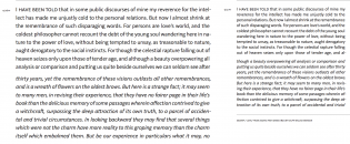
A number of recent typefaces take cues from the American Gothic (most intriguing to me, perhaps, is H&M’s custom typeface HM Ampersand), but the humanist touch Van Bronkhorst introduces with MVB Solitaire adds unexpected lyrical warmness to an otherwise cold genre. The central styles are spaced a little on the tight side for immersive reading. They are, however, ideal for shorter stretches of text, or a supporting role in a bigger hierarchy. An added bonus is the relatively close weights that may come in handy when striving for consistent color across different font sizes. MVB Solitaire has a certain modesty to it, but there’s no lack of interest.
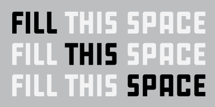
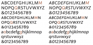
As it gains weight, its compact proportions makes for a strong display face. Although far from squarish, it feels hefty, confident, outspoken, and authoritative. The subtleties of the craftsmanship become apparent when slimming down. Look at the tension of the cursive ‘y’, the tail of the roman ‘a’, or the way the loop of the binocular ‘g’ connects to its base. The mix of dynamism and rigidity lends stability to fluid shapes.
I hold the deepest regard for Van Bronkhorst’s ability to lift his eyes from letterforms, even above words, to the texture and color of sentences and paragraphs. Many a typeface drowns in its own flamboyance. The stalwarts, the workhorses that will live long past trends, all have one thing in common: restraint.
MVB Solitaire is one of these. I was first drawn to its fine detailing, but what makes it a keeper is the consistent high quality of the execution: the even color, the thoughtful alternates, and the modest, but edgy, style. Van Bronkhorst is certainly dealing us a great deck of cards.
Disclaimer: The editor of Typographica, Stephen Coles, is also the author of the promotional texts presenting MVB Solitaire.


