
Well-drawn one-off display faces are easy to find, especially bouncy sans serifs.
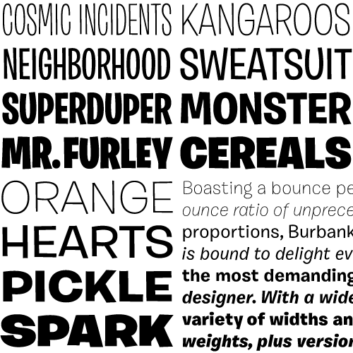
Complete suites of faces in this genre, however, are nearly impossible to find, especially families that are crafted with as much care as Burbank. I really appreciate seeing the attention to detail that usually goes into “serious” text family put into a family primarily intended for display use. Burbank never breaks character, convincingly reproducing bouncy and spontaneous handlettering down to the details without ever looking gimmicky. Even the Small Italics look perfectly natural, and the automatically-inserted alternates subtly maintain the illusion that type set in Burbank Big is real lettering, not just a typographic facsimile. Apparently it took a decade to finish this face – sometimes the simplest ideas are the most challenging to execute well.
love the font