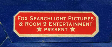
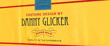
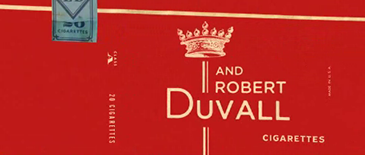
 As soon as I saw the stellar titles that opened Thank You for Smoking, I had to fight the font freak in me from attempting to identify each typeface
 Shadowplay Studio (now Smith & Lee) used to emulate the look of cigarette packaging. Now that Veer has formally called us out, I’ll take a whack at it.

Copperplate Gothic 30 AB by Frederic W. Goudy

Fenway Park by Jason Walcott
As originally identified by Grant at The Skinny.

Bodoni Bold Condensed by Giambattista Bodoni

Freestyle Script by Martin Wait
Maybe should have used Freestyle Script Alternate. It connects.

Neue Helvetica 66 Medium Italic by Max Miedinger
I believe that is Solex Bold Italic by Zuzana Licko underneath.

Blackoak by Kim Chansler and Barbara Redick
Manually condensed?

Dunno
Looks like one of the Victorian types digitized by Dan X. Solo for Dover.

ITC Century Condensed Book by Tony Stan

Avenir 85 Heavy by Adrian Frutiger

Charlotte Book by Michael Gills
One of those blasted glyphic serifs that I can’t recall. Thank you, Yves!

Gotham Bold by Tobias Frere-Jones
Hand lettering for “Cigarettes”

Avenida by John Chippendale

ITC Avant Garde Book Oblique by Tom Carnase and Herb Lubalin

Dunno
A puzzler. It’s almost Bordeaux, but more square and with bracketless serifs.

Eccentric by Gustav F. Schroeder

Helvetica Black Condensed and Italic
Could someone tell me how I can get a gig as a music supervisor?

Dunno
Orbit rounds and ITC Blair straights. Also: Stainless.

FF Scala Sans Caps by Martin Majoor

ITC Blair Medium and Adobe Caslon by Carol Twombly

Knockout Junior Flyweight by Jonathan Hoefler (perhaps)

Peignot by A.M. Cassandre
This looks really lovely, despite the fake small caps. I always forget Peignot as an alternative to Optima when seeking a sans with stroke contrast.

FF Scala Bold by Martin Majoor

Hand drawn?

Fenway Park and Franklin Gothic No. 2 Roman
That’s it. I think I got 23 out of 28. Not bad. But not great for a freak. Help me fill in the blanks.


Mindy Marin is Corvinus Skylight.
To not have recognized it…
Do you mean Corvinus Skyline? Close, but not quite. Note the ‘A’ and ‘R’.
hi guys I’m doing a work about that movie and I need a part of the script. It’s the part in which they explain that the way to reach the target it’s making actors smoking while they act.
If someone can help me I will be so grateful.
Thanks
Is that COOPERplate or COPPERplate?
Wow. 4 years is never too late to fix a typo. Thanks, Luke!
About “Davis O. Sacks” font, is:
”La Reyna Catalina NF”.
I could be wrong, but isn’t “Rolfe Kent” set in Berthold Akzidenz Grotesk Light Extended? Then they skewed at an angle so the letters distort even more (especially the “O”).