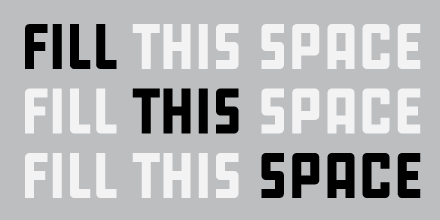
Sprawl is based on urban planning maps and the density of population in Belgium. The basic shape of the letters is the same so that when you type they can lock into each other.
— Brecht Cuppens, designer

Get a prominent ad at a reasonable rate. Support Typographica.
WOW! I can’t say anything more than that.
WOW!
When I discovered TerraServer a few years ago, I was immensly inspired by the vast collection of satellite photos and maps. I’m glad to see that I’m not the only one.
How many glasses of Westmalle Tripel does it take to come up with that? I guess it’s not the MOST useless thing to come out of Belgium, but it’s up there.
Ah, the champagne of beers. Considering it’s triple fermented (what is it, like 15% alcohol?) probably only three or so.
hhp
mmmm, speaking of beer that packs a punch, anything by unibroue in canada is very tasty, and is usually about 8%, although i think Terrible is 10%, try the maudite, or some of the beers with fruit esters, like the peach. i’m sure the Terrible would inspire some type faces of its own.