With every typeface he designs, Yoann Minet’s self-imposed mission is to question well-established design principles instead of deliberately breaking them. Prime examples of this ethos from the French designer’s portfolio include Ostia, the Traulha suite, and Stratos. All of them challenge different aspects of proportions, shapes, and family structure — and Totentanz is certainly no exception.
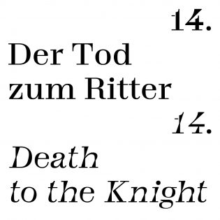
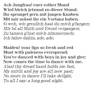
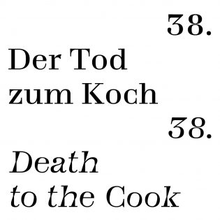
Inspired by eighteenth-century inscriptions found during excursions into the dark and — from what a quick image search reveals — slightly morbid Catacombs of Paris, Minet drew a modest French modern typeface with a pinch of carefully placed oddities and clever stone-carving references. Aside from the unorthodox construction of the lowercase g — not in the Pierre Didot way — the numerals immediately got my attention. Stenciled and featuring plenty of unconventional design decisions, they make a lively addition to the typeface.
Omitting the idea of a wide range of widths, weights, and styles, Minet focuses on a compact family structure of three styles. Instead of the traditional setup of Regular, Italic, and Bold, Totentanz’s roman is accompanied by matching slanted and backslanted styles. While the latter probably cannot yet be called a design trend, it is increasingly capturing type designers’ attention. Traditionally used to mark bodies of water in cartography, backslanted styles are on the rise again today thanks to research, experiments, designs, and releases from 2016.
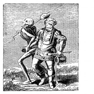
Much like in the eponymous medieval allegory of the Danse Macabre, the skeletons of Totentanz’s slanted styles twist, shake, and dance. Letters start to warp into constructed shapes, experience a slight shift in contrast, or morph into stencil-like abstractions of themselves. By challenging calligraphic conventions and restrictions, Yoann ended up with a contemporary approach to an established genre, enriching it with a variety of unique shapes and an unusual texture.
Totentanz may not be the most usable or versatile release of the year, but it is definitely an unconventional and thought-provoking typeface — or, as the French would say: C’est mortel!
